---
title: "Astro Image vs Picture: Data From 25 Real Projects"
description: "Astro Image or Picture? We analyzed 25 Astro projects and six live sites to compare responsive images, AVIF, WebP, mobile delivery, and trade-offs."
canonical_url: "https://webaloha.co/astro-image-vs-picture/"
markdown_url: "https://webaloha.co/astro-image-vs-picture.md"
date_published: "2026-08-13T00:00:00.000Z"
date_modified: "2026-08-13T00:00:00.000Z"
author: "Lucky Oleg"
---
# Astro Image vs Picture: Data From 25 Real Projects
Author: [Lucky Oleg](https://webaloha.co/authors/lucky-oleg/) | Published Aug 13, 2026
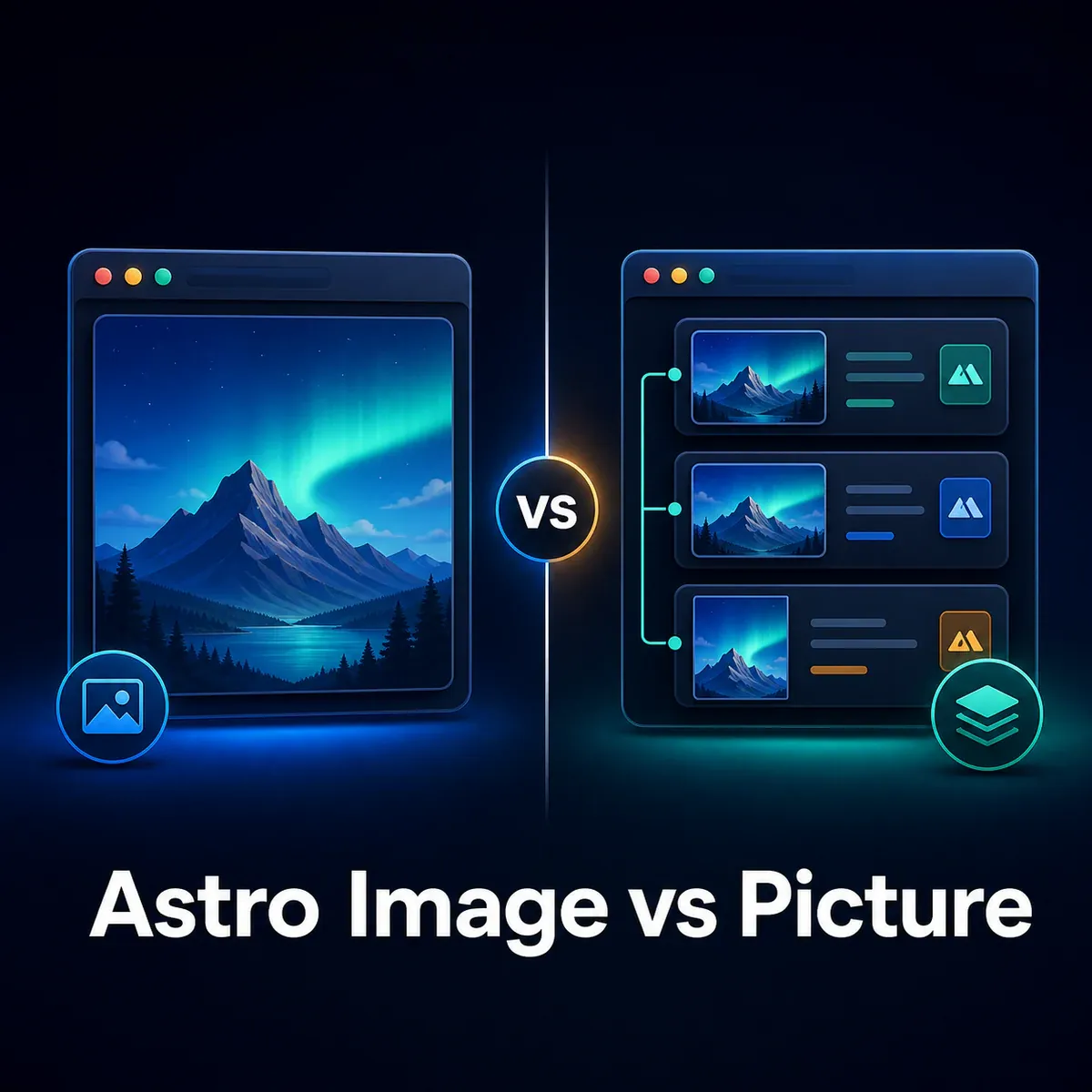
**Use Astro `` for most imported images. Use Astro `` when you need the browser to choose between generated formats, such as AVIF with a WebP fallback.** Both components can produce responsive `srcset` candidates, so `` is not automatically faster or more responsive.
That is the short answer. The more useful answer comes from what browsers actually download.
We audited **25 real Astro project repositories**, examined **643 Astro image-component invocations**, compared **1,219 matched AVIF and WebP candidates**, and tested the selected images on **six live sites**. The result was clear: our projects used `` as the default and reserved `` mainly for important photographic images where multi-format delivery had a measurable reason to exist.
The headline result was promising but not universal. On the six live pages, the browser-selected AVIF was a **median 47.3% smaller** than the equivalent-width WebP fallback. In the larger generated-candidate sample, AVIF was smaller most of the time, but it was larger in **5.3% of comparisons**.
This guide explains the component difference, the numbers, the exceptions, and the decision we now use in client projects.
## Astro Image vs Picture: The Short Answer
Astro `` is the simpler optimized-image component. Astro `` wraps a fallback `` in a native `` element and adds one or more `` elements, normally so the browser can select a preferred format.
| Situation | Recommended choice | Why |
| --- | --- | --- |
| Ordinary article, card, gallery, or content image | `` | Simpler markup and one output format can be enough |
| Hero or likely LCP photograph | `` when measured | AVIF can be offered before a WebP fallback |
| One known output format | `` with `format` | No additional format track is needed |
| Different mobile and desktop crops | Native `` plus `getImage()` | This is art direction, not only format negotiation |
| Logo, icon, or SVG | Usually SVG or `` | Multiple photographic formats often add no value |
| File that must be served unchanged | Native `` or `public/` asset | Astro processing is intentionally bypassed |
If you remember one rule, make it this: **choose `` for a specific source-selection requirement, not because it sounds like an upgraded ``.**
## What Is the Difference Between Astro `` and ``?
The practical difference is the HTML each component emits.
For local `src/` images and authorized remote images, Astro `` generates an optimized ``. It can transform dimensions, format, and quality, infer intrinsic dimensions for local imports, and produce responsive candidates. According to the [official Astro image guide](https://docs.astro.build/en/guides/images/), this processing happens during the build for prerendered pages and on demand for server-rendered pages.
Astro `` generates a native `` wrapper with `` elements and a fallback ``. Its `formats` array controls the ordered source formats, while `fallbackFormat` controls the inner image. The [Astro assets API](https://docs.astro.build/en/reference/modules/astro-assets/) recommends listing the most modern preferred format first.
With `formats={['avif']}` and `fallbackFormat="webp"`, the simplified output looks like this:
```
```
The browser evaluates the `` elements and then selects an appropriate candidate from `srcset`. Unsupported formats or non-matching media conditions are skipped. The fallback `` remains essential for alternative text, dimensions, loading behavior, and compatibility. This selection process is defined by the [HTML responsive images standard](https://html.spec.whatwg.org/dev/images.html).
### A Terminology Trap: ``, ``, ``, and ``
These names are easy to mix up:
- `` is an Astro component imported from `astro:assets`.
- `` is another Astro component imported from `astro:assets`.
- `` is the native HTML container emitted by Astro ``.
- `` is the native HTML image element and the fallback inside ``.
- Lowercase `` is not the standard HTML element for ordinary page images. The usual native element is ``.
This article compares Astro’s two built-in components. Native markup still matters because it is what browsers, crawlers, and accessibility tools ultimately receive.
## What We Found Across 25 Astro Projects
Our fleet used `` for routine delivery and `` selectively for high-value images.
| Fleet measurement | `` | `` |
| --- | --- | --- |
| Component invocations | 520 | 123 |
| Share of managed component calls | 80.9% | 19.1% |
| Calls with responsive `widths` and `sizes` | 92.9% | 98.4% |
| Explicitly lazy-loaded | 76.0% | 7.3% |
| Priority or high fetch priority | 3.1% | 90.2% |
| AVIF requested | Not the default pattern | 100% |
These are source-code invocations, not the number of images a visitor sees. A component inside a loop can render many images, while one shared hero component can serve many routes. Even with that limitation, the pattern is strong: `` was rare and overwhelmingly associated with priority imagery.
Our working policy after the audit is therefore:
1. Use responsive `` for ordinary cards, article images, screenshots, galleries, and below-the-fold content.
2. Consider AVIF-first `` for important photographic heroes and other high-value images.
3. Keep a WebP fallback unless there is a clear reason to use another format.
4. Test representative assets instead of applying one codec rule to every logo, screenshot, graphic, and photograph.
That approach also keeps the code easier to understand. A gallery with 40 routine thumbnails does not need two format tracks merely because the hero benefited from them.
### How We Measured the 25 Projects
We ran this audit on **August 12–13, 2026** and kept three evidence sets separate:
- **Source audit:** 25 Astro repositories, counted recursively, with component props classified by usage pattern
- **Live browser audit:** six deployed sites tested in fresh Chromium contexts at desktop and high-density mobile viewports
- **Generated-output audit:** 1,219 same-dimension AVIF/WebP pairs matched from existing build artifacts across 15 repositories
The repositories include client and internal work, so fleet-level figures are aggregated. We identify the public Elevare example below because its current output can be inspected publicly; we verified the unchanged source and delivery history in its project repository. Existing build artifacts were not rebuilt solely for this study, and the source counts describe component invocations rather than rendered image totals.
## How Much Smaller Was AVIF Than WebP?
In our sample, AVIF usually beat WebP at the same candidate width, but the result varied substantially by asset.
| Measurement | Sample | Result |
| --- | --- | --- |
| Browser-selected AVIF versus same-width WebP | Six live sites | Median **47.3% smaller** |
| Matched generated AVIF/WebP candidates | 1,219 pairs across 15 repositories | Weighted result **40.3% smaller** |
| Median result per generated pair | 1,219 pairs | **44.7% smaller** |
| Pairs where AVIF was smaller | 1,155 of 1,219 | **94.7%** |
| Pairs where AVIF was larger | 64 of 1,219 | **5.3%** |
The six live comparisons ranged from **14.2% to 53.2% smaller**. That range is more informative than one universal average. It shows why a team should test real outputs from its own encoder settings and visual material.
The 1,219-pair result came from existing generated-output snapshots, not fresh builds performed for this article. We treat it as broad supporting evidence. The six-site result came from current live pages opened in fresh Chromium contexts, where we recorded the browser-selected image and compared it with the same-width WebP fallback.
Most importantly, these are **format-delivery savings**, not proof that the `` tag compressed anything. The component supplied an AVIF option; the browser chose it; the codec and settings created the byte difference.
## A Same-Source Astro Image vs Picture Comparison
The cleanest case came from an [Elevare Homes article hero](https://elevarehomes.lt/straipsniai/kaip-brangiau-parduoti-nt/). We verified the current output on the public page and compared the implementation history in the project repository.
Before and after the delivery change, the project used the same 1,383,464-byte WebP source, the same intrinsic dimensions, the same five candidate widths, and the same `sizes="100vw"` rule. The meaningful change was from WebP through `` to AVIF-first `` with a WebP fallback.
| Viewport test | Selected AVIF | Same-width WebP fallback | AVIF saving |
| --- | --- | --- | --- |
| Mobile, 390 CSS px at DPR 2, 960w candidate | 79,256 bytes | 162,482 bytes | **51.2%** |
| Desktop, 1440 CSS px at DPR 1, 1600w candidate | 206,447 bytes | 432,680 bytes | **52.3%** |
The defensible conclusion is:
> In this same-source comparison, the AVIF selected through Astro `` was approximately 51–52% smaller than the equivalent WebP fallback.
It would be inaccurate to say that changing the component alone saved 52%. `` could also generate AVIF, but it would not provide a WebP format fallback through `` selection.
## Does `` Make Mobile Images Smaller?
Not by itself. Astro `` and `` can both generate responsive candidates. Resolution savings come from giving the browser useful widths and an accurate `sizes` description; format savings can come from the selected codec.
Across six live sites, the selected `` resource at **390 CSS pixels and DPR 2** was a median **46.5% smaller** than the selected resource at **1440 CSS pixels and DPR 1**. The individual results ranged from **0% to 73.5% smaller**.
The 0% result is the valuable one. On that site, the high-density phone and desktop both selected the same 1080w candidate because the available width ladder did not offer a better intermediate choice. The markup was responsive, but the candidate grid did not reduce that phone’s bytes.

*Responsive delivery works when the browser has an appropriate candidate to select. The component name does not choose the width for you.*
The most common causes of disappointing mobile selection are:
- Missing or inaccurate `sizes`
- Candidate widths with gaps that are too large
- A high device-pixel ratio that pushes a phone toward a desktop-sized file
- A layout whose rendered image width is much smaller than the declared slot
- One fixed width disguised by responsive CSS
Our [responsive web design guide](https://webaloha.co/responsive-web-design-mobile-first/) covers the broader mobile layout decisions. For image delivery specifically, inspect `currentSrc` in the browser instead of assuming that a populated `srcset` proves the right candidate was chosen.
## Responsive Astro Image Examples
For a routine content image, we would normally start with ``:
```
---
import { Image } from 'astro:assets';
import articlePhoto from '../assets/article-photo.jpg';
---
```
For a measured hero-image opportunity, we might use ``:
```
---
import { Picture } from 'astro:assets';
import heroPhoto from '../assets/hero-photo.jpg';
---
```
Astro’s `priority` prop sets eager loading, synchronous decoding, and high fetch priority. Reserve it for the image that is actually likely to become the Largest Contentful Paint element. The [web.dev LCP guidance](https://web.dev/articles/optimize-lcp) warns against lazy-loading the LCP resource and against marking too many resources as high priority.
## When Astro `` Is the Better Choice
Astro `` is the better default when one optimized format is sufficient.
That normally includes:
- Article body images
- Blog cards and service cards
- Product thumbnails and below-the-fold gallery items
- Screenshots and interface examples
- Logos, icons, and graphics that have already been evaluated for their best format
- Images where simpler generated output matters more than format fallback
For assets eligible for processing, the current Astro assets API says `` produces WebP by default unless another format is specified. It can still create multiple responsive widths, so choosing it does not mean giving up `srcset`, `sizes`, inferred local-image dimensions, or CLS protection.
In our fleet, 76% of `` calls were explicitly lazy-loaded. That aligns with its dominant role: routine content that should not compete with the first viewport’s critical image.
## When Astro `` Is Worth Using
Astro `` is worth using when multiple generated formats solve a real delivery problem.
Good candidates include:
- A large photographic hero where AVIF is measurably smaller
- The likely LCP image, when its fallback and priority are configured deliberately
- A prominent editorial or product image reused at large display sizes
- A design that requires an explicit modern-format preference with graceful fallback
- A known browser-support requirement that makes a fallback format important
The built-in component is primarily a **multiple-formats-and-sizes component for one source image**. If you need true art direction, such as a tight portrait crop on phones and a wide scene on desktops, generate the variants with Astro’s `getImage()` and assemble a native `` with media-specific `` elements.
That distinction matters. Format negotiation asks, “Can this browser display AVIF?” Art direction asks, “Which composition should this viewport see?” They are separate decisions.
## What Can Go Wrong With AVIF, WebP, and Responsive Images?
AVIF and WebP are not automatic wins for every source.
In our 1,219 matched pairs, AVIF was larger 64 times. All 64 outliers came from one project’s secondary imagery. A separate manually prepared 47-image AVIF/WebP library was almost tied in aggregate size, with AVIF larger for 35 of the 47 assets.
We also found large-width generated WebPs that were heavier than already well-compressed JPEG sources. Selecting a candidate wider than its rendered slot, using lossless settings, or comparing non-equivalent quality values can reverse the expected result.
Common reasons include:
- Different codecs interpret a numeric quality value differently
- Screenshots and flat graphics behave differently from photographs
- The source is already compressed efficiently
- A generated candidate is wider than the source’s useful display size
- Lossless output is enabled where lossy output would be appropriate
- Very small files have proportionally larger container overhead
Use our [Image Compressor](https://webaloha.co/tools/image-compressor/) for quick format experiments, but judge both bytes and visual quality. The [image SEO guide](https://webaloha.co/image-seo-guide/) covers filenames, alternative text, dimensions, discoverability, and other considerations that no component can solve alone.
## Does `` Increase Build Time and Storage?
It can. Every requested format can create its own width candidates.
For the matched candidates in our generated-output sample, the AVIF files occupied about **49.1 MB** and the WebP fallbacks about **82.2 MB**. Keeping both tracks therefore used approximately **59.7% more matched artifact bytes** than the WebP candidates alone.
That does **not** mean the visitor downloaded 59.7% more. A compatible browser selected one candidate from one source track. It means the build and deployment had to create and store more files.
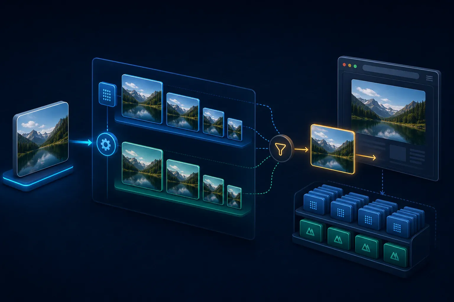
*Multiple format and width tracks increase generated output, while the browser normally downloads one selected candidate.*
Astro’s own responsive-image documentation notes that generating many images can increase prerender build time. We did not benchmark build duration in this audit, so we are not attaching a time-saving or time-cost percentage to our fleet.
This is why image audits should keep three measurements separate:
| Measurement | What it answers | What it does not answer |
| --- | --- | --- |
| Source repository bytes | How much original media the project stores | What visitors download |
| Generated artifact bytes | How much the build creates and deploys | Which files one browser selects |
| Browser-selected resource bytes | What a tested browser receives for that image | LCP improvement or ranking impact by itself |
If you want to check a public page, use the [Page Weight Checker](https://webaloha.co/tools/page-weight-checker/) for a first pass, then confirm the selected image requests and timing in browser developer tools.
## Does Astro Picture Improve SEO, LCP, or GEO?
There is no documented Google ranking factor or AI-citation guarantee tied to the Astro component name. Its potential value is indirect: a smaller appropriate image can reduce resource-loading time, while correct dimensions can protect layout stability.
Google’s [image SEO documentation](https://developers.google.com/search/docs/appearance/google-images) confirms that it can discover an image through the fallback `` inside ``. It also recommends responsive images, meaningful alternative text, relevant surrounding content, and a crawlable fallback source.
For LCP, bytes are only one part of the timeline. Discovery delay, request priority, server response, and render delay can dominate. A lighter AVIF does not prove a better LCP unless you measure the result. Use the [Core Web Vitals Checker](https://webaloha.co/tools/core-web-vitals-checker/) and a browser waterfall rather than inferring performance from the extension.
For SEO and GEO, the durable advantages are:
- A clear answer near the top of the page
- Descriptive headings that match real questions
- Visible methodology and sample sizes
- Original evidence with limitations
- Accessible alternative text and semantic HTML
- Valid Article and breadcrumb structured data, plus visible FAQ content
- Relevant internal links to supporting resources
The component supports delivery. The content and evidence establish expertise.
FAQPage structured data can make visible questions easier for machines to parse, but it does not guarantee a Google rich result or an AI citation. [Google’s FAQ documentation](https://developers.google.com/search/docs/appearance/structured-data/faqpage) says FAQ rich results are limited to well-known, authoritative government and health sites.
## `src/` vs `public/`: A Bigger Decision Than the Tag
Keep local images in `src/` when you want Astro to transform, optimize, and bundle them. The official Astro guide states that files in `public/` are served or copied as-is and do not receive Astro’s processing or responsive-image behavior.
That means this:
```
src/ image + Astro Image/Picture → eligible for optimization and generated candidates
public/ image URL → served unchanged
```
A hand-authored native `` can still serve excellent pre-generated AVIF and WebP files from `public/`. But the project must create and maintain those formats and sizes itself; the native tag does not invoke Astro’s image pipeline.
Likewise, native `` plus a custom `srcset` can deliver responsive image sizes without Astro `` at all. The delivery strategy matters more than the component label.
## Practical Astro Image Optimization Checklist
Use this checklist before standardizing one pattern across a project:
1. Keep transformable local images in `src/`.
2. Start with `` for ordinary content.
3. Add `` when multiple formats have a measured benefit.
4. Supply useful candidate widths or a suitable responsive layout.
5. Write an accurate `sizes` value for the rendered slot.
6. Use AVIF with a WebP fallback for suitable photography, not blindly for every asset.
7. Prioritize only the actual hero or likely LCP image.
8. Lazy-load below-the-fold images.
9. Preserve intrinsic dimensions or an equivalent aspect ratio.
10. Write descriptive alt text based on the image’s purpose.
11. Inspect `currentSrc` on a normal phone, a high-DPR phone, and desktop.
12. Compare representative AVIF, WebP, and source outputs for both bytes and visual quality.
13. Measure LCP separately; do not infer it from file size.
14. Watch generated artifact count and deployment size on image-heavy projects.
Our [free Image SEO Checker](https://webaloha.co/tools/image-seo-checker/) can catch missing alt text, dimensions, lazy loading, format, and responsive-markup issues on a public page. For a wider performance review, see our [Core Web Vitals guide](https://webaloha.co/core-web-vitals-what-they-are-how-to-fix/).
## Final Decision: Astro Image or Picture?
Use `` by default. Move to `` when you can name the source-selection benefit and confirm it in generated output or the browser.
| Question | If yes | If no |
| --- | --- | --- |
| Do you need multiple generated formats? | Use `` | Use `` |
| Is this an important photographic hero? | Test AVIF plus WebP fallback | Keep the simpler path |
| Do you need different crops by breakpoint? | Use native `` plus `getImage()` | Either Astro component can work |
| Are responsive widths and `sizes` accurate? | Verify `currentSrc` | Fix those before debating formats |
| Did AVIF win on representative assets? | Keep it for that image class | Use WebP or the better measured format |
| Is generated output becoming excessive? | Reduce formats or width candidates | Keep the measured setup |
The 25-project evidence supports a restrained approach: **`` for the majority, `` for selected high-value photography, and browser measurements for the final decision.**
If you need help applying this across a real site, our [Astro website development service](https://webaloha.co/astro-website-design-development/) includes responsive image architecture, performance testing, technical SEO, and production validation.
## Astro Image vs Picture: Frequently Asked Questions
Should I use Astro Image or Picture?
Use Astro Image for most imported images. Choose Astro Picture when you want the browser to choose between multiple generated formats, such as AVIF with a WebP fallback. Both components can generate responsive widths, so Picture is not automatically the more responsive option.
Is Astro Picture always faster than Image?
No. Performance depends on the candidate the browser selects, its dimensions, format, quality, the sizes value, and the image itself. Picture can offer a smaller AVIF source, but it can also generate extra files without reducing the selected download if the candidate grid or encoding settings are poorly chosen.
How much smaller is AVIF than WebP in Astro?
In our six-site live sample, the browser-selected AVIF was a median 47.3% smaller than the equivalent-width WebP fallback. Across 1,219 matched generated candidates, the median saving was 44.7%, but AVIF was larger in 5.3% of pairs. These are results from our sample, not a universal codec guarantee.
Does Astro Picture automatically make an image responsive?
No. Astro Image and Picture can both be responsive. Responsive delivery comes from a suitable layout or from accurate widths and sizes values that give the browser useful candidates. A Picture element with only one size may offer format fallback without saving mobile users any resolution bytes.
Can Astro Picture use different crops on mobile and desktop?
Astro’s built-in Picture component is primarily designed to generate multiple formats and sizes from one source image. For true art direction with a different crop or source at a media query, use a native picture element and generate the required assets with Astro’s getImage function.
Does Astro Picture improve SEO directly?
No documented Google ranking factor is tied to the component name. Picture can support faster delivery, while a fallback img keeps the image discoverable, but SEO still depends on useful content, descriptive alt text, intrinsic dimensions, crawlable URLs, page experience, and whether the image is relevant to the page.
Does using Picture increase Astro build output?
Usually, because each requested format can have its own responsive width candidates. In our matched artifact sample, keeping AVIF and WebP candidates used 59.7% more generated bytes than WebP alone. The browser normally downloads one selected candidate, not every generated file, so build storage and visitor transfer are different measurements.
Why can AVIF be larger than WebP for some images?
Codec efficiency depends on image content, dimensions, encoder behavior, and quality settings. Numeric quality values are not directly equivalent across formats. Screenshots, graphics, already-compressed sources, and some photographic details can therefore produce an AVIF that is larger or visibly worse than the matching WebP.
Recommended tools
## Recommended tools for this guide
Use these free tools to apply the ideas from this guide to your own website.
[
Image Compressor
](https://webaloha.co/tools/image-compressor/)[
Mobile-Friendly Checker
](https://webaloha.co/tools/mobile-friendly-checker/)[
Core Web Vitals Checker
](https://webaloha.co/tools/core-web-vitals-checker/)
Useful info? Spread the Aloha:
[](https://webaloha.co/authors/lucky-oleg/)
[Lucky Oleg](https://webaloha.co/authors/lucky-oleg/)[](https://www.linkedin.com/in/luckyoleg/)
Lucky Oleg is the founder of Web Aloha, a web design & SEO agency helping businesses ride the digital wave. With years of experience in WordPress, technical SEO, and web performance, he writes about what actually works in the real world.
#### Related guides from Web Aloha
[
WordPress vs Astro: Which Is Better for Business in 2026?
](https://webaloha.co/wordpress-vs-astro-for-business/)[
Benefits of Static Websites: Speed, Security, and SEO in 2026
](https://webaloha.co/benefits-of-static-websites/)[
Is Astro Right for Your Business? A Decision Guide
](https://webaloha.co/is-astro-right-for-your-business/)
 ` or `public/` asset | Astro processing is intentionally bypassed |
If you remember one rule, make it this: **choose `
` or `public/` asset | Astro processing is intentionally bypassed |
If you remember one rule, make it this: **choose `