The best website font is not the one getting the most likes in a design trend roundup. It is the one that sounds like your business and lets people read, understand, and act without thinking about the font at all.

For most business websites, a safe formula is:
- Choose one highly readable family for body text
- Use a bolder style of the same family, or one contrasting family, for headings
- Keep decorative fonts away from paragraphs, forms, menus, and buttons
- Test your real words on a real phone before calling it done
- Confirm the license, language coverage, and loading cost
If you already have a site, start with our free Website Font Checker. It reports detected font families, source categories, weights, and stacks where available, which is much faster than making typography decisions from memory or a blurry screenshot.
Then use this guide to decide what should stay, what should go, and what your next font needs to do. Once the families are chosen, our companion website typography guide covers font sizes, hierarchy, line height, line length, and responsive implementation.
How to Choose Fonts for a Website: The Quick Answer
Do not begin by scrolling through 1,900 fonts and waiting for one to whisper your company name.
Begin with the job.
| Your website needs to feel… | Sensible direction | Good families to test | Watch out for |
|---|---|---|---|
| Clear, capable, and modern | Humanist or neutral sans-serif | Inter, Source Sans 3, Work Sans, Figtree | A generic result with no hierarchy |
| Established and trustworthy | Sturdy serif with a calm sans-serif | Lora, Merriweather, Noto Serif | Tiny or delicate serifs in body copy |
| Premium and editorial | Expressive serif headings, restrained body text | Fraunces, Playfair Display, Source Sans 3 | Thin strokes and fashion-magazine type at small sizes |
| Friendly and local | Warm serif or rounded humanist sans-serif | Lora, Nunito Sans, Work Sans | Becoming childish or overly cute |
| Technical and precise | Grotesque sans-serif with optional mono accent | Space Grotesk, IBM Plex Sans, IBM Plex Mono | Using monospace for long paragraphs |
| Bold and creative | Characterful display face plus quiet body family | Bricolage Grotesque, Fraunces, Inter | Letting the loud font take over every element |
| Accessible and highly legible | Open, distinguishable letterforms | Atkinson Hyperlegible Next, Noto Sans | Treating one typeface as an accessibility guarantee |
| Multilingual | Coordinated families built for the required scripts | Noto families matched to each script | Discovering missing glyphs after launch |
These are starting directions, not laws of human emotion. A serif does not automatically make a company trustworthy, and a geometric sans does not magically turn it into a startup. Copy, color, spacing, imagery, and familiarity all change how a typeface feels.
The goal is a coherent system, not a font personality quiz.
Best Fonts for Websites: A Shortlist by Job
If you want names to start testing, these are the families we would put on a shortlist in October 2026. Each one is judged against the same five criteria:
- Legibility: open shapes and distinct characters at the size the job needs
- Weights: enough weights for regular text, emphasis and headings
- Language support: the character sets Google Fonts serves for the family
- Licence: whether you may embed and self-host it on a commercial website
- File size: the Latin WOFF2 file Google Fonts served Chrome on 20 October 2026, covering every weight unless noted
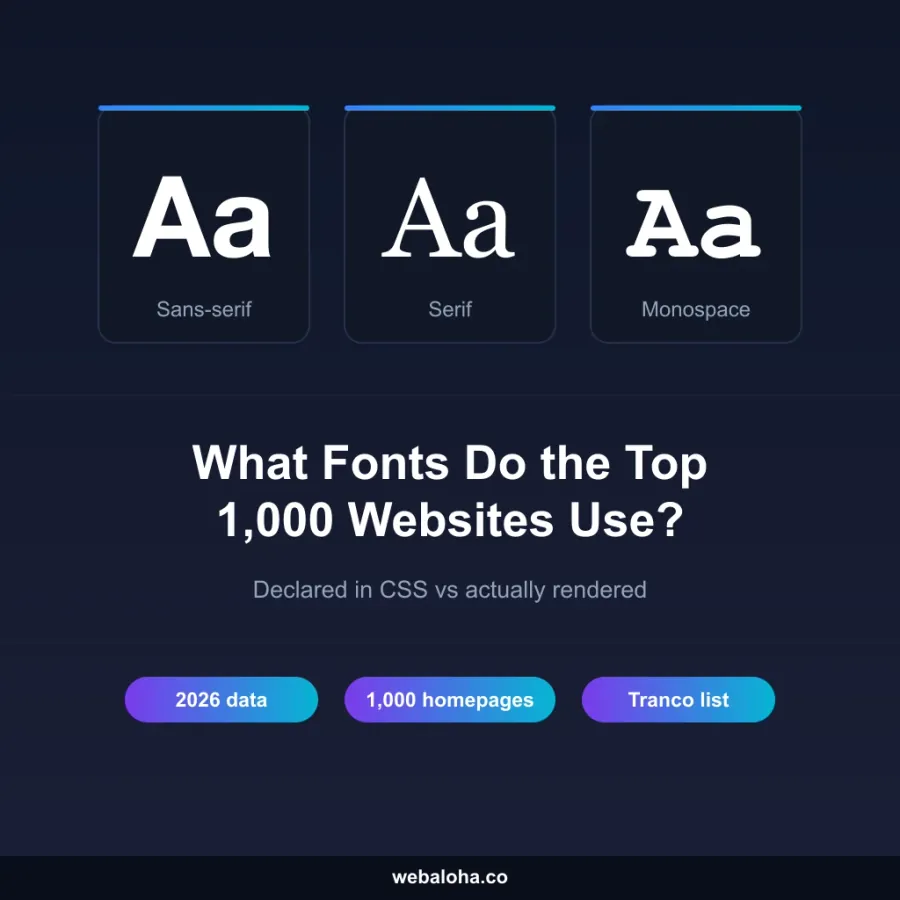
The last column shows how many of the 511 homepages we measured in our study of what the top 1,000 sites use drew most of their text in that family. That is popularity, not proof of quality: big brands often use custom fonts, and a rare family can be an excellent choice.
Body text
| Font | Legibility | Weights | Languages | Licence | File size | Top 1,000 study: main body font (n = 511) |
|---|---|---|---|---|---|---|
| Inter | Large x-height and open shapes, designed for screen interfaces | 100 to 900, variable | Latin, Latin Extended, Cyrillic, Greek, Vietnamese | SIL Open Font License | 47 KB | 41 (8%) |
| Source Sans 3 | Humanist shapes with open apertures, made by Adobe for interface text | 200 to 900, variable | Latin, Latin Extended, Cyrillic, Greek, Vietnamese | SIL Open Font License | 28 KB | 15 (3%), all versions |
| Atkinson Hyperlegible Next | Built by the Braille Institute around clear character differences for low-vision readers | 200 to 800, variable | Latin and Latin Extended | SIL Open Font License | 33 KB | None |
| System UI font | Each platform’s own interface font: San Francisco, Segoe UI or Roboto | Set by the device | Whatever the device supports | Comes with the operating system | 0 KB | 38 (7%) |
Inter is the most common body font in our study and the one we would test first for a modern business site. Source Sans 3 gives a slightly warmer, more compact alternative in a smaller file. Atkinson Hyperlegible Next is the accessibility-led choice; no homepage in our sample used it for body text, which says more about brand habits than about the font. The system UI stack downloads nothing, at the cost of a different look on every device.
Headings
| Font | Legibility | Weights | Languages | Licence | File size | Top 1,000 study: main heading font (n = 458) |
|---|---|---|---|---|---|---|
| Inter (bold weights) | One family for headings and text; hierarchy comes from weight and size | 100 to 900, variable | Latin, Latin Extended, Cyrillic, Greek, Vietnamese | SIL Open Font License | No extra file if Inter is already your body font | 21 (5%) |
| Montserrat | Wide geometric letters with presence at large sizes; too wide for long paragraphs | 100 to 900, variable | Latin, Latin Extended, Cyrillic, Vietnamese | SIL Open Font License | 35 KB | 11 (2%) |
| Poppins | Round geometric shapes that stay clear in short headings | 9 static weights, 100 to 900 | Latin, Latin Extended, Devanagari | SIL Open Font License | About 8 KB per weight | 10 (2%) |
| Fraunces | Soft serif with an optical-size axis that adjusts detail for large text | 100 to 900, variable | Latin, Latin Extended, Vietnamese | SIL Open Font License | 36 KB | 1 (0.2%) |
| Playfair Display | High-contrast serif for large headlines; thin strokes break down at small sizes | 400 to 900, variable | Latin, Latin Extended, Cyrillic, Vietnamese | SIL Open Font License | 38 KB | None |
326 of 458 (71%) homepages with headings in our study used the same family for headings and body text, so start by testing your body font in bold before adding a second family. Montserrat is the clearest heading specialist in the sample: 11 homepages used it for headings and 4 for body text. Fraunces and Playfair Display are rarer and more distinctive, which is the point of a serif heading.
Multilingual sites
| Font | Legibility | Weights | Languages | Licence | File size | Top 1,000 study: main body font (n = 511) |
|---|---|---|---|---|---|---|
| Noto Sans | Neutral design from Google’s Noto project, which aims to cover every script | 100 to 900, variable | Latin, Latin Extended, Cyrillic, Greek, Vietnamese, Devanagari; separate Noto families for Arabic, Japanese and many other scripts | SIL Open Font License | 35 KB | 4 (0.8%); named in the CSS of 123 homepages (24%) |
| Open Sans | Humanist shapes designed for print, web and mobile interfaces | 300 to 800, variable | Latin, Latin Extended, Cyrillic, Greek, Hebrew, Vietnamese | SIL Open Font License | 42 KB | 26 (5%) |
| Roboto | Android’s interface font, familiar to many visitors | 100 to 900, variable | Latin, Latin Extended, Cyrillic, Greek, Vietnamese | SIL Open Font License | 37 KB | 26 (5%) |
| IBM Plex Sans | Neutral grotesque shapes with a technical feel; companion Plex Sans families for Arabic, Hebrew, Devanagari, Thai and Japanese share its design | 100 to 700, variable | Latin, Latin Extended, Cyrillic, Greek, Vietnamese | SIL Open Font License | 39 KB | 1 (0.2%) |
Noto Sans is named in many stylesheets as a fallback for other languages, yet rarely draws the main text, because sites load it only for the scripts that need it. That is the right pattern: load the Latin file for every visitor and the Arabic, Hebrew or Japanese file only on pages that use those scripts. Before choosing, run your own character test (see the language section below), because “supports Cyrillic” does not guarantee every letter your content uses.
File sizes grow with every extra subset, weight and italic, and a self-hosted copy can be smaller if you subset it carefully. All the Google Fonts families above can be self-hosted under their licence; our Font Self-Hosting Helper turns a Google Fonts URL into WOFF2 files and @font-face CSS.
Serif vs Sans Serif vs Display Fonts for Websites
You do not need a typography degree, but knowing the main roles helps you rule out bad fits quickly.
| Font category | Typical visual character | Best website roles | Main risk |
|---|---|---|---|
| Sans-serif | Clean strokes without serifs; can feel neutral, warm, geometric, or industrial | Body copy, navigation, forms, dashboards, headings | Choosing two similar sans-serifs that look like an accident |
| Serif | Small finishing strokes; ranges from sturdy book faces to delicate high-contrast designs | Headings, editorial layouts, professional brands, and body text when designed for screens | Fine details disappearing at small sizes or low contrast |
| Slab serif | Heavier, block-like serifs | Bold headings, packaging-led brands, confident accents | Looking bulky when used everywhere |
| Expressive display, including script styles | Display describes the job; the shapes may be decorative, handwritten, condensed, or otherwise unusual | Short headlines, campaign moments, logos, occasional accents | Poor legibility in paragraphs, buttons, prices, or small mobile text |
| Monospace | Every character occupies the same width | Code, technical data, labels, deliberate tech accents | Slower, wider reading in normal body copy |
Modern screens render good serif faces perfectly well. “Sans-serif is always readable; serif is only for print” is an old shortcut, not a useful rule in 2026. The actual letterforms, size, weight, spacing, contrast, and reading context matter more than the category label.
Google’s own beginner guide to choosing web fonts recommends matching the family to the amount and purpose of the text. Headlines can carry more personality. Long passages need a family designed to stay comfortable and coherent across many words.
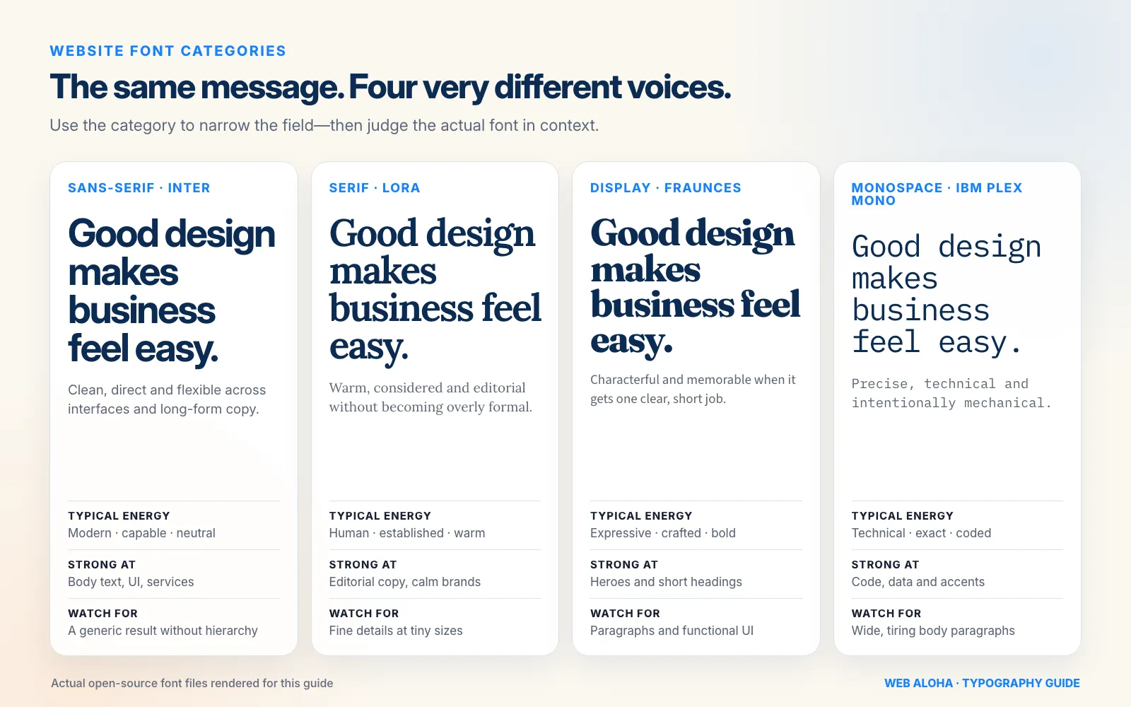
The category narrows the field. The actual letterforms, role, size, and surrounding design decide whether the font works.
How to Match a Website Font to Your Brand
Before comparing typefaces, write down three adjectives you want customers to use after meeting your business.
Not ten. Three.
Examples:
- Accountant: calm, precise, dependable
- Independent café: warm, crafted, relaxed
- Architecture studio: minimal, intelligent, confident
- Children’s therapist: safe, gentle, clear
- Cybersecurity company: technical, controlled, alert
Now add the words you do not want. “Premium” can easily drift into cold. “Friendly” can become childish. “Bold” can become aggressive. Those boundaries are often more useful than the positive adjectives.
Translate brand traits into type features
| Brand direction | Features worth testing | Features to be careful with |
|---|---|---|
| Calm and dependable | Moderate proportions, regular rhythm, sturdy medium and bold weights | Extreme width, sharp details, hairline weights |
| Warm and human | Open shapes, humanist construction, soft serif details | Overly perfect geometric circles |
| Premium and refined | Controlled contrast, generous spacing, elegant display shapes | Thin body text, low-contrast gray, tiny uppercase labels |
| Energetic and bold | Strong weight range, condensed or wide display styles, punchy headings | All-caps paragraphs and crowded navigation |
| Technical and precise | Grotesque or geometric sans, clear numerals, mono accents | Making every sentence look like source code |
| Playful and creative | Unexpected details, rounded forms, expressive headline face | Novelty letters in functional UI text |
Then test the font with your actual business language:
- Your company name
- Your main service and location
- Your strongest homepage headline
- A normal 80-word paragraph
- A button such as “Request a quote”
- Prices, dates, percentages, and phone numbers
- Customer names and place names with accents
“The quick brown fox jumps over the lazy dog” contains the alphabet. It does not contain your brand.
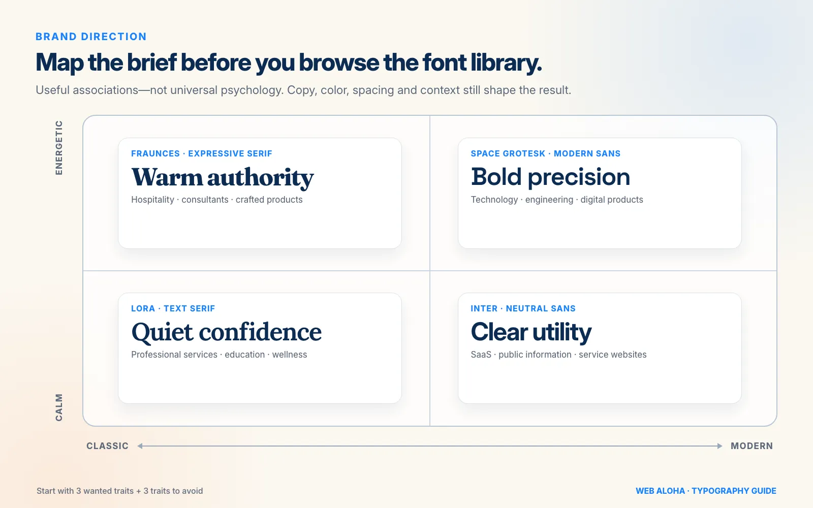
Mood labels are useful briefing shorthand, not universal psychology. Your copy, colors, spacing, imagery, and audience still shape the result.
Choose the Body Font Before the Headline Font
The loud heading font gets attention in mockups. The body font does most of the work after launch.
Body text explains your service, answers objections, carries case studies, and moves a visitor toward an inquiry. Choose it first.
What makes a good website body font?
Look for:
- Open counters and apertures. Enclosed spaces and open gaps inside letters should not close up at normal sizes.
- Distinct characters. Check
I,l, and1;Oand0;cande; plus braces, currency signs, and numerals if your business uses them. - A useful family. Regular, medium or semibold, bold, and true italics usually cover a business site. More is not always better.
- Comfortable proportions. Very narrow fonts squeeze words; very wide fonts reduce how much fits on a line.
- Stable small-size rendering. Test menus, form labels, captions, and mobile cards, not only a 72-pixel hero heading.
- Language support. The family must contain the characters your customers and content actually use.
- A sensible fallback. If the web font is slow or unavailable, the page should remain readable and reasonably stable.
There is no universally “accessible font.” The UK Home Office’s accessibility typography guidance makes the same point: different users have different needs. Pick clear letterforms, then test the complete reading experience instead of stamping a font “ADA compliant” and heading to the beach.
For an accessibility-led option, Atkinson Hyperlegible Next is worth testing. The Braille Institute designed the family around character distinction for readers with low vision; its 2025 update added seven weights, variable versions, and support for more than 150 Latin-script languages. It is a strong option, not a substitute for contrast, sizing, spacing, zoom, and user testing.
How to Pair Website Fonts Without a Design Degree
Here is the easiest font-pairing rule: you may not need a pair.
A well-made family with a broad weight range can handle body copy, buttons, navigation, and headings. One-family systems are consistent, easier to load, and harder to mess up.
System font or web font?
A custom web font is optional. A system stack such as system-ui, -apple-system, BlinkMacSystemFont, "Segoe UI", sans-serif adds no font-file download and feels native, but its appearance varies by operating system and gives you less brand distinction. Use it when simplicity matters most. Use a hosted web font when the typeface earns its weight through brand, language, or readability needs.
WebAloha itself uses one locally hosted variable family, League Spartan, across headings, body copy, navigation, and buttons. The hierarchy comes from weight, size, spacing, and layout rather than a second family.
If the brand needs more contrast, add a second family with one clear job.
Five font-pairing rules that hold up
- Give each font a role. One for body text, one for headings. Do not swap them randomly from section to section.
- Create visible contrast. A serif with a sans-serif is an easy route, but weight, width, and proportion can also create contrast within one category.
- Avoid near-duplicates. Two geometric sans-serifs with almost the same structure create visual static, not harmony.
- Keep the mood compatible. A formal legal body face and a bouncy party headline may contrast, but they are probably telling different stories.
- Build hierarchy with more than font changes. Size, weight, spacing, color, and layout should still make the page understandable if both families are replaced by fallbacks.
Good website font combinations by business type
All examples below are available through Google Fonts under open-source licenses at the time of writing. They are practical starting points, not universal winners. Popularity is a weak guide anyway: in our 2026 study of the fonts on the top 1,000 websites, even the most common body font appeared on only a small share of homepages.
| Heading font | Body font | Character | Good fit for | Why the pairing works |
|---|---|---|---|---|
| Fraunces | Source Sans 3 | Warm, confident, slightly editorial | Consultants, hospitality, thoughtful consumer brands | Expressive serif headings sit above a calm humanist sans |
| Space Grotesk | Inter | Modern, technical, direct | SaaS, engineering, digital services | Distinctive headline proportions with a quiet UI workhorse |
| Lora | Work Sans | Approachable, established, human | Local services, wellness, education | Soft serif detail adds warmth while the sans keeps long copy clean |
| Playfair Display | Source Sans 3 | Refined, editorial, premium | Fashion, interiors, boutique hospitality | High-contrast headings get room to shine without entering body text |
| Noto serif family for the required script | Matching Noto sans family | Global, flexible, understated | Multilingual organizations and content-heavy sites | Coordinated script-specific families make visual consistency easier |
| Atkinson Hyperlegible Next Bold | Atkinson Hyperlegible Next Regular | Clear, practical, accessible-minded | Public information, healthcare, essential services | One family provides distinction, many weights, and a leaner system |
| Bricolage Grotesque | Inter | Creative, lively, contemporary | Studios, events, creative products | Personality stays in short headings; utility text stays restrained |
If one of these is close but not quite right, change one variable at a time. Keep the body font and compare three headline families, or keep the heading and compare three body families. Changing everything at once turns a decision into font soup.
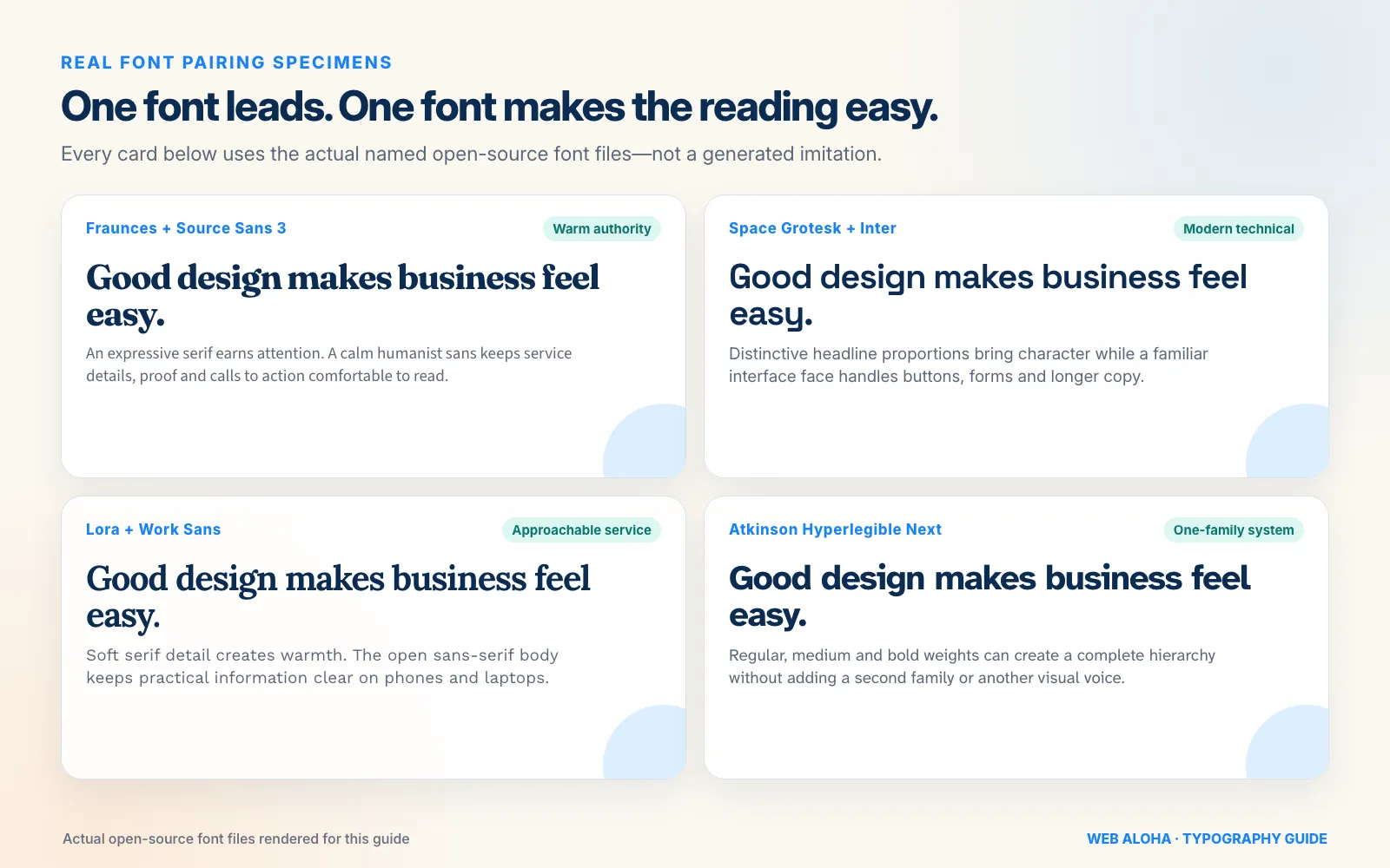
Every specimen above is rendered with the named open-source font files. One font earns attention; the other makes the reading easy.
Test Website Fonts With Real Content and Real Screens
Font directory previews are a first date. Your website is the road trip.
Build one small test page containing:
- A long homepage heading that wraps to two or three lines
- A short service card heading
- Two normal paragraphs
- Navigation, breadcrumbs, and a button
- A form label, input, error message, and success message
- A price, phone number, date, percentage, and currency symbol
- Bold, italic, linked, and uppercase text
- Your longest customer or location name
- Every language the final site will publish
Test it at 320 pixels wide, on a normal phone, on a laptop, and at 200% browser zoom. Ask someone who did not choose the font to find a service, read a paragraph, and complete the form. “Looks nice in Figma” is not the same as “works on the website.”
Need inspiration from another site? Inspect it with our Website Font Checker, then study the broader system: size, weight, spacing, color, and layout. The tool reads public HTML and CSS references, so confirm the final rendered font in browser developer tools when accuracy matters. Borrow the lesson, not someone else’s identity.
Website Font Accessibility Checklist
WCAG does not certify individual typefaces and does not specify one mandatory website font size. Accessibility comes from the typography system and the page around it.
At minimum:
- Keep normal text at 4.5:1 contrast against its background; large text may use 3:1 under WCAG 2.2’s minimum contrast criterion. Check your actual color pair with our Color Contrast Checker.
- Let people resize text to 200% without losing content or functionality.
- Ensure the layout survives user-adjusted line height, paragraph spacing, letter spacing, and word spacing. WCAG 2.2’s text-spacing criterion tests adaptability; it does not require every site to use those override values by default.
- Avoid thin weights for small text, long passages in italics, and entire paragraphs in uppercase.
- Keep body copy left-aligned in left-to-right languages unless the writing system calls for something else.
- Check buttons, tables, cards, cookie banners, and navigation after zooming. These are where text tends to clip.
- Do not turn important words into images merely to preserve a special typeface.
- Test with people whenever the website serves an audience with known access needs.
Our detailed website typography guide explains how to turn these requirements into a practical type scale, line height, measure, and responsive hierarchy.
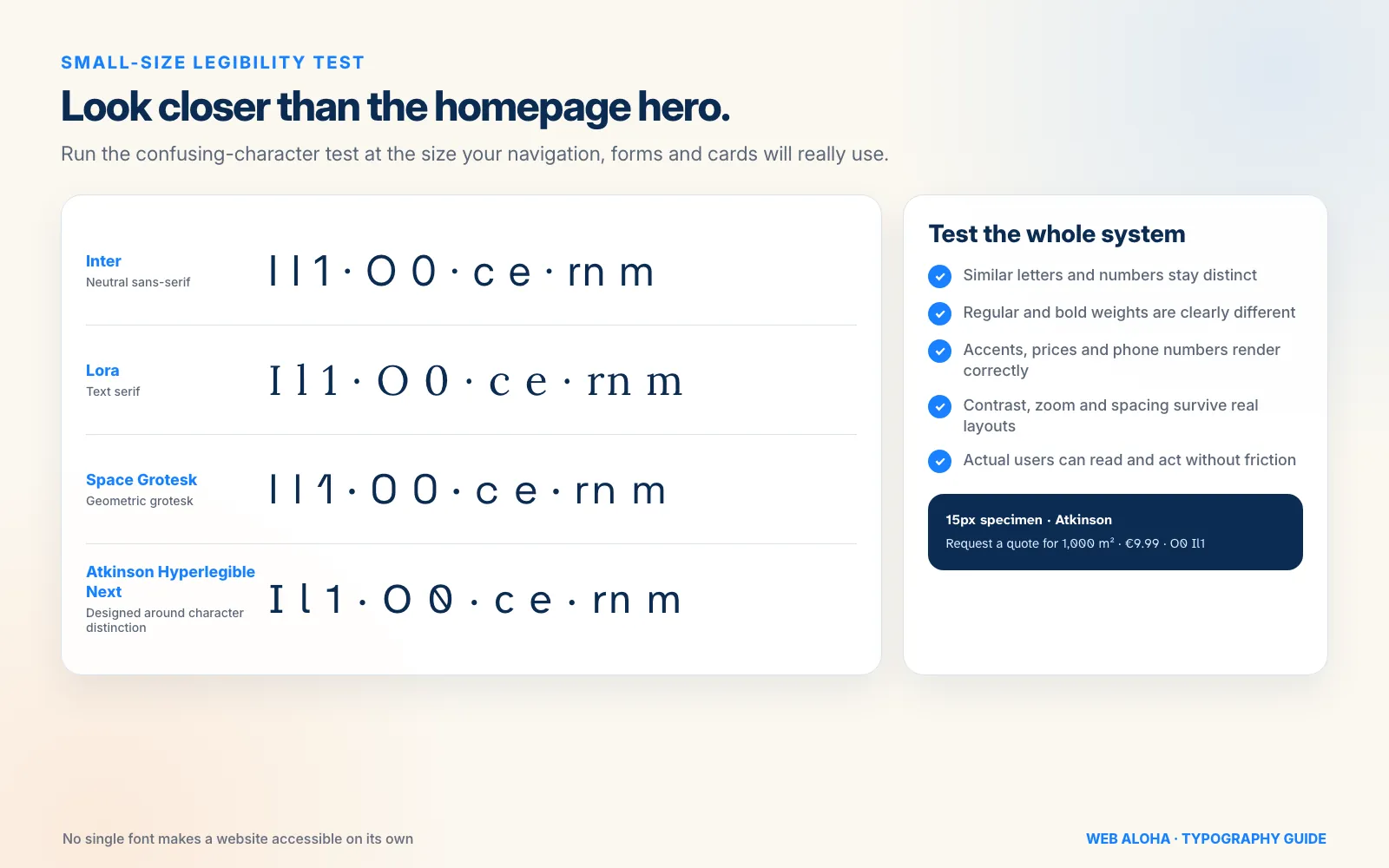
Test ambiguous characters in the navigation, forms, prices, and cards where visitors will really meet them, not only in a giant hero heading.
Font Licensing for Business Websites
Fonts are software. “I found the file online” is not a license.
Before approving a family, record:
- Where it came from
- Who owns or distributes it
- The exact license and version
- Whether website embedding and commercial use are allowed
- Which domains, traffic limits, apps, or users are covered
- Whether the files may be self-hosted, modified, or handed to another supplier
- Who owns the account if the font is subscription-based
Google states that all Google Fonts are open source and usable in commercial projects. Most use the SIL Open Font License, though the exact license file travels with each family and should still be kept.
Paid fonts vary. A desktop license that covers a logo or exported image may not cover embedding font files on a public website. Monotype’s font licensing overview describes a license as the agreement that defines how the font software may be used; Adobe’s font licensing guidance similarly separates fonts added through its service from files governed by another foundry’s agreement. If the terms are unclear, ask the foundry before launch.
This is not the glamorous part of choosing a font. Neither is receiving a licensing complaint six months later.
Web Font Performance: Keep the Personality, Lose the Baggage
A beautiful font that delays every page is doing the brand no favors.
Use this production checklist:
- Keep the site to one or two font families unless there is a real content need for more.
- Load only the weights and styles actually used.
- Prefer WOFF2 for modern web delivery.
- Define a robust fallback stack.
- Choose a deliberate
font-displaystrategy so text does not stay unnecessarily invisible. - Preload only truly critical font files; every preload competes with other important resources.
- Subset by character range only when you understand the language and maintenance trade-offs.
- Measure the finished site instead of assuming a technique made it faster.
Variable fonts are useful when one file replaces several weights or widths. They are not a magic compression button. If the design uses only regular and bold, two static files may still be leaner than a large variable family. MDN’s current web font guide explains font-display, weight and style declarations, and character ranges; web.dev’s variable font guide covers the benefits and trade-offs of the format.
If your site currently calls Google Fonts at runtime, our Google Font Self-Hosting Helper can extract the available WOFF2 files and generate local @font-face CSS. Self-hosting gives you more control, but you still need to preserve the license, keep only the required files, and test the result.
Choose Fonts That Support Every Website Language
Seeing accented letters in a specimen does not prove the font supports your full publishing plan.
Create a character test from real content. For a European business, that might include:
Ąžuolas žydi · 9,99 € · Č, Ę, Ł, Ñ, Ø, ß
Also test:
- Customer and employee names
- Place names
- Currency and mathematical symbols
- Smart quotes, apostrophes, dashes, and ellipses
- Bold and italic versions of the same characters
- Cyrillic, Greek, Arabic, Hebrew, Devanagari, CJK, or any other script the site genuinely uses
Google Fonts provides a language filter, and its FAQ points to Noto’s coordinated collection for broad language and script coverage. A fallback can fill a missing glyph, but one word suddenly rendered in a different family often looks broken. Choose the relevant Noto family for each script (such as Noto Sans Arabic or a regional Noto Sans CJK family) rather than assuming plain Noto Sans and Noto Serif contain every writing system.
Website Font Trends in 2026: Useful Signal, Not a Shopping List
One visible direction in 2026 is a move beyond ultra-neutral branding toward more expressive type. Figma’s 2026 web design trends highlights custom fonts, oversized headlines, motion, dynamic pairings, and variable fonts, while Google Design’s look at personalized variable fonts shows how one family can support both expression and functional range. The useful business lesson is not to copy every trend. It is to reserve expression for places where it helps.
Three trends are genuinely useful for business websites:
- A characterful heading with a quiet body font. You get brand distinction without asking visitors to decode every paragraph.
- One-family variable systems. A capable variable family can create hierarchy through weight, width, or optical size while keeping the identity coherent.
- Serifs in digital-first brands. A screen-ready serif can add warmth and distinction in categories crowded with nearly identical sans-serif websites.
Three trends deserve restraint:
- Kinetic or constantly animated type. Motion can distract, affect performance, and create accessibility issues if it does not respect user preferences.
- Ultra-thin editorial text. It may look luxurious in a giant mockup and disappear on a sunny phone screen.
- Deliberately awkward display lettering everywhere. Friction can be interesting in a campaign headline. It is not fun in checkout, navigation, or a medical form.
Choose the durable system first. Sprinkle trend on top. Otherwise your 2026 redesign will need rescuing in 2027.
A Practical Website Font Decision Workflow
Use this process to turn an endless browse into a shortlist:
1. Audit the current website
Run the Website Font Checker. Record the detected families, source categories, weights, and stacks the scan returns, then confirm important file-level details in browser developer tools. Ask whether the current problem is really the font or the way it is sized and spaced.
2. Define the job
Write three brand adjectives, three unwanted traits, the audience, the website languages, and the content types the family must cover.
3. Shortlist three body families
Reject anything without the required characters, useful weights, clear licensing, or comfortable small-size text.
4. Decide whether one family is enough
Try hierarchy using regular, medium, bold, size, and spacing. Add a heading family only if the brand still needs more contrast or personality.
5. Build one real-content specimen
Use the same homepage heading, paragraph, service card, form, button, price, and multilingual sample for every option.
6. Test the boring but important stuff
Check mobile wrapping, zoom, contrast, spacing overrides, fallback behavior, font files, loading order, and the license.
7. Choose and document the system
Record the family names, roles, weights, styles, fallback stacks, licenses, and usage rules. Your future designer should not have to solve the mystery again.
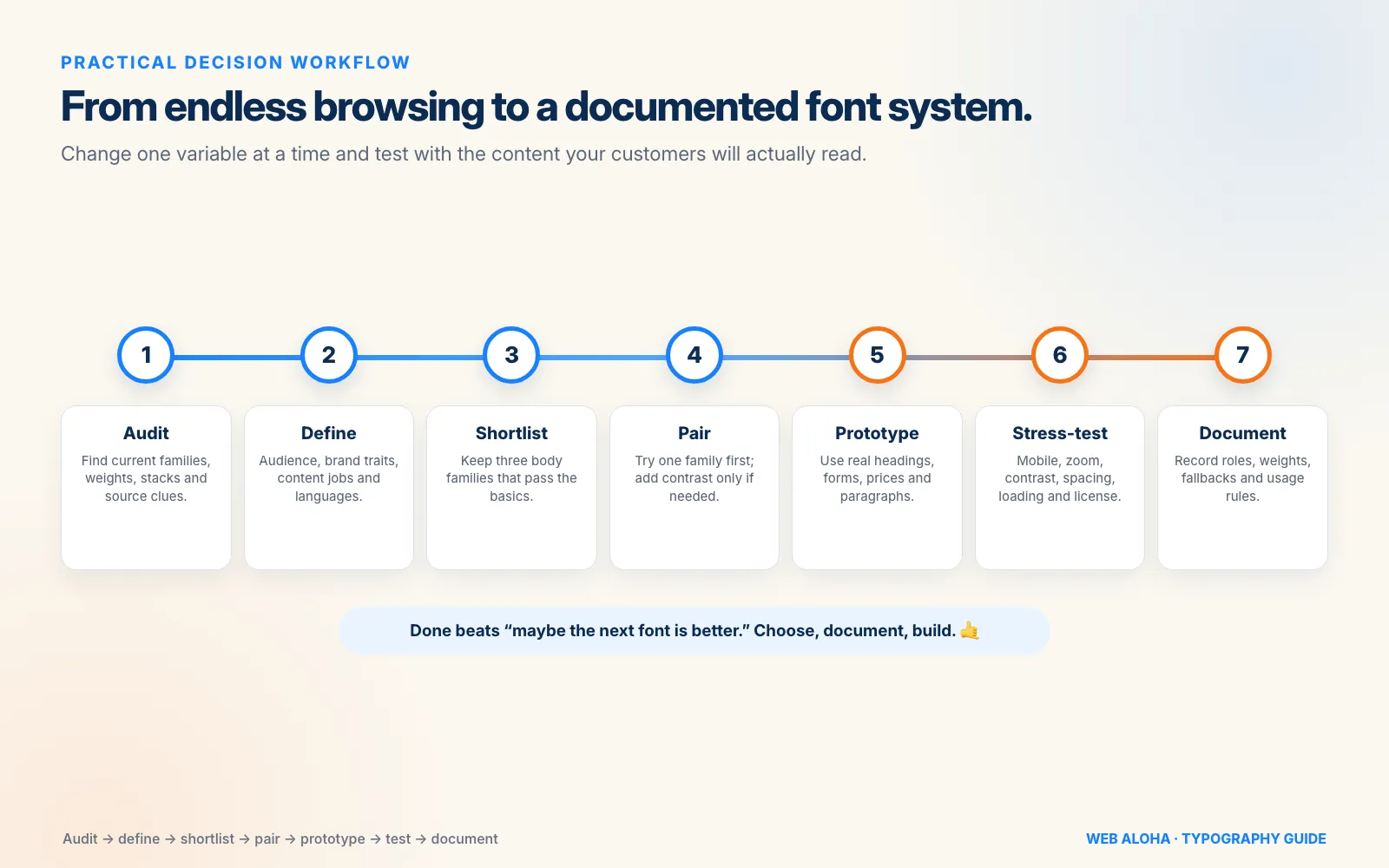
Changing one variable at a time beats opening another 200 browser tabs in search of a mythical perfect font.
Common Website Font Mistakes
Avoid these and your site is already ahead of half the font roundups on the internet:
- Picking a typeface from one giant hero word and never testing paragraphs
- Using three or four families because each looked good separately
- Choosing two fonts too similar to create useful contrast
- Using a display, script, or condensed face in long body copy
- Loading every available weight “just in case”
- Assuming a variable font is always the lightest option
- Forgetting italics, numerals, currency, accents, or non-Latin scripts
- Using light gray and thin weight together, then blaming the typeface
- Treating Google Fonts, Adobe Fonts, and a random free-font download as the same license
- Copying a competitor’s font without asking whether it fits your own audience
- Expecting a new font to fix weak copy, cluttered layout, or missing hierarchy
When a Font Change Becomes a Website Redesign
Sometimes typography is the loose thread. Pull it and the whole layout starts moving.
A new family changes line breaks, button widths, navigation spacing, card heights, form labels, and the visual balance of every page. If the website also has inconsistent colors, cramped mobile layouts, weak calls to action, or ten years of page-builder leftovers, swapping a font alone will not solve the real problem.
For a new site, our web design services cover the full system: brand direction, typography, content hierarchy, responsive layouts, accessibility, performance, and the pages that turn attention into inquiries.
For an existing site with good bones, our website redesign services focus on what needs to change without replacing things simply for sport. We can audit the current font stack, keep the pieces that work, and rebuild the experience around clearer business goals.
Final Checklist: Choosing the Right Website Font
Before approving the type:
- Does it fit the business without leaning on a cliché?
- Can people read normal paragraphs comfortably on mobile?
- Are important characters easy to distinguish?
- Do the available weights create a clear hierarchy?
- Does it support every language, name, number, and symbol you need?
- Is the website use properly licensed and documented?
- Can you build the design with one family, or two at most?
- Are you loading only the font files you use?
- Does the fallback remain readable and reasonably stable?
- Does the page pass contrast, zoom, and text-spacing tests?
- Have you tested real content with someone who did not choose the font?
If all eleven answers are yes, stop browsing. You have a website to build. 🤙
Frequently asked questions
What is the best font for a business website?
There is no single best font for every business. A strong default is a versatile, screen-friendly family such as Inter, Source Sans 3, Work Sans, or Atkinson Hyperlegible Next, then an optional heading font that adds the right brand personality. The best choice is the one that fits your audience, remains readable on mobile, supports every character you need, is properly licensed, and does not make the site unnecessarily heavy.
What are the most popular fonts on big websites?
In our September 2026 study of 511 homepages behind the top 1,000 domains, Inter drew most of the body text on 41 (8%), the operating system's UI font on 38 (7%), Arial on 29 (6%), and Open Sans and Roboto on 26 each (5%). Popularity shows what large sites chose, not which font is best for yours.
Should a website use one font or two fonts?
One font family is often enough, especially when it includes several useful weights or variable axes. Two families can work well when they have clear jobs, usually one for headings and one for body text. Most business websites do not need three. Strong hierarchy comes from size, weight, spacing, and color as much as it comes from changing fonts.
Is a serif or sans-serif font better for websites?
Neither category is automatically better. Well-designed serif and sans-serif fonts can both be readable on modern screens. Sans-serif families are a safe, flexible starting point for interfaces and body copy; serif families can bring warmth, authority, or an editorial feel. Judge the actual typeface at the sizes, weights, devices, and line lengths your website will use.
Should I use a system font or a web font?
A system font stack needs no font download, feels native, and is simple to maintain, but its appearance varies by device and offers less brand distinction. A hosted web font gives you a more consistent visual voice, but adds files, licensing, and loading decisions. Use a web font only when it earns that extra complexity through brand, language, or readability needs.
How do I know whether a website font is accessible?
Check whether similar characters are easy to distinguish, counters and apertures stay open at small sizes, regular and bold weights are clear, and long paragraphs remain comfortable on mobile. Then test the whole typography system: contrast, size, line height, line length, zoom, text-spacing overrides, real languages, and real users. No font is universally accessible on its own.
Are Google Fonts free for commercial website use?
Yes. Google says every family in Google Fonts is released under an open-source license and can be used in commercial projects. Still keep the license file, check the terms for the exact family, and follow any conditions if you modify or redistribute it. Fonts downloaded from other websites may have completely different terms.
Do custom fonts slow down a website?
They can. Every family, weight, style, and language subset may add another file or more font data to download. Keep only the variants you use, serve WOFF2, define a sensible fallback, and choose an appropriate font-display strategy. A variable font can be efficient when it replaces several static files, but it is not automatically smaller than loading just one or two static styles.
How can I find out what font a website uses?
Use Web Aloha's Website Font Checker to inspect public HTML and CSS for detected font families, source categories, weights, stacks, and file references where available. Because source code can contain unused rules and does not always reveal the final computed font, confirm important findings in browser developer tools.
What are some good font combinations for business websites?
Reliable starting combinations include Fraunces with Source Sans 3 for warm authority, Space Grotesk with Inter for a modern technical feel, and Lora with Work Sans for an approachable service brand. For multilingual needs, match coordinated Noto families to the required scripts. Atkinson Hyperlegible Next can also carry headings and body text by itself. Test every pairing with your own words before committing.