Good website typography is almost invisible. Visitors do not stop to admire a 1.6 line height. They just understand the page, find what matters, and keep reading without their eyes doing overtime.

For most business websites, a solid starting system looks like this:
- Body text around 16–18px, set with relative units
- Body line height around 1.5–1.7
- Reading columns around 45–75 characters wide
- A small, consistent type scale instead of 14 random font sizes
- Headings that scale down smoothly on mobile
- Real semantic heading elements, not paragraphs dressed up as headings
- WCAG-compliant contrast, zoom, reflow, and spacing resilience
- Only the font files and weights the design genuinely uses
Those are starting points, not sacred typography commandments. A 16px font with a small x-height can look noticeably smaller than another font at 16px. A line height that feels relaxed in one serif can look like a loose staircase in a wide sans serif. The browser, content, language, and audience all get a vote.
If you are improving an existing website, first run it through our Website Font Checker. It can identify declared font families, stacks, sources, files, and weights in the page source and eligible stylesheets. It does not calculate the final rendered style of every element, so confirm important findings in browser developer tools.
This guide focuses on making a typography system work. If you are still deciding which typeface fits your brand, read our companion guide on how to choose fonts for your website.
Website Typography Best Practices: Quick Reference
Here is a practical baseline for a content-led business website. The desktop sizes are not targets you must hit; they are ranges worth testing with your actual font and copy.
| Role | Mobile start | Desktop range | In px (16px root) | Line height | Typical use |
|---|---|---|---|---|---|
| Small/supporting text | 0.875–1rem (14–16px) | 0.875–1rem (14–16px) | 14–16px mobile 14–16px desktop | 1.4–1.6 | Captions, metadata, helper text |
| Body text | 1–1.125rem (16–18px) | 1–1.1875rem (16–19px) | 16–18px mobile 16–19px desktop | 1.5–1.7 | Paragraphs, lists, form guidance |
| Lead paragraph | 1.125–1.25rem (18–20px) | 1.25–1.5rem (20–24px) | 18–20px mobile 20–24px desktop | 1.4–1.6 | Page introductions |
| H4 | 1–1.125rem (16–18px) | 1.125–1.25rem (18–20px) | 16–18px mobile 18–20px desktop | 1.25–1.4 | Minor headings inside a section; set apart by weight |
| H3 | 1.25–1.5rem (20–24px) | 1.5–2rem (24–32px) | 20–24px mobile 24–32px desktop | 1.15–1.35 | Subsections and cards |
| H2 | 1.75–2.25rem (28–36px) | 2.25–3rem (36–48px) | 28–36px mobile 36–48px desktop | 1.1–1.25 | Main page sections |
| H1 | 2.25–3rem (36–48px) | 3–4.5rem (48–72px) | 36–48px mobile 48–72px desktop | 1.05–1.15 | One clear page title |
Keep essential instructions, buttons, prices, form labels, and navigation out of tiny-text limbo. Supporting text can be visually quieter without becoming difficult to read.
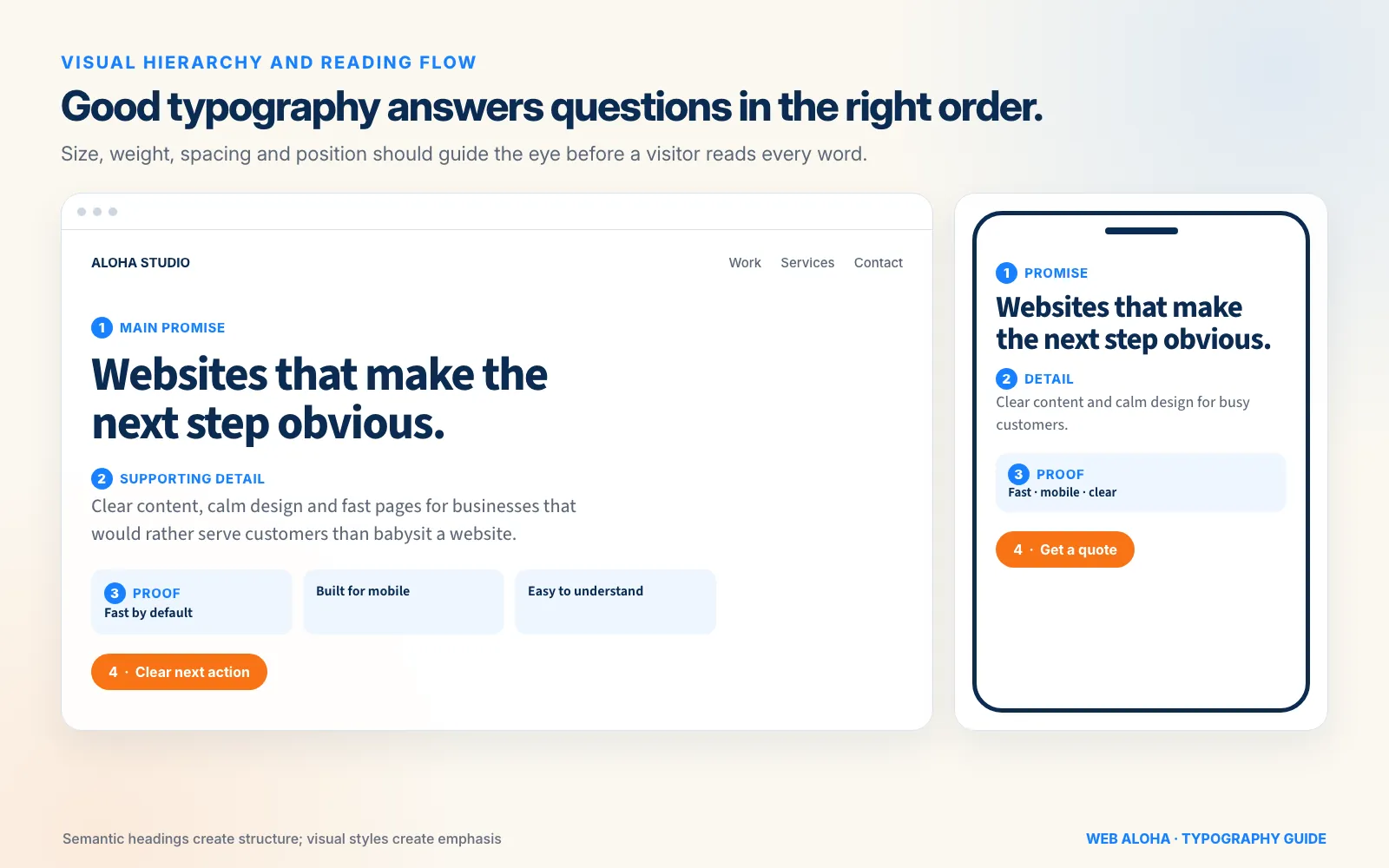
Semantic headings create the page structure; size, weight, spacing, and position create the visual emphasis.
What Is Website Typography?
Website typography is the complete system used to present written content on a screen. The typeface gets the attention, but the system does the real work.
It includes:
- Font family, fallback stack, styles, and weights
- Font size and type scale
- Line height, paragraph spacing, letter spacing, and word spacing
- Line length and text-column width
- Heading hierarchy and semantic HTML
- Alignment, contrast, emphasis, and link styling
- Responsive behavior across different screens and zoom levels
- Font delivery, fallback behavior, and layout stability
A beautiful typeface with cramped paragraphs is poor typography. So is a perfectly spaced page where every heading looks equally important. Typography succeeds when the words, hierarchy, layout, and loading behavior work together.
At Web Aloha, we have designed more than 90 websites. The lesson is not that every business needs the same font settings. It is that every good website needs a deliberate system. When size, spacing, and hierarchy are decided component by component, the page slowly turns into typographic soup.
Best Font Size for Website Body Text
For a typical business website, 16–18px is a sensible body-text starting range. In CSS, that is usually 1rem to 1.125rem when the user’s browser default is 16px.
That is a practical design recommendation, not a WCAG minimum. WCAG 2.2 does not prescribe one universal body font size. It focuses on outcomes such as contrast, resizing, reflow, and the ability to apply custom text spacing without breaking the page.
Why might 16px work for one font and not another?
- X-height: Fonts with taller lowercase letters often look larger at the same CSS size.
- Stroke weight: Thin text can look faint even when the contrast ratio technically passes.
- Width and spacing: A wide font fills a line faster and may need a different column width.
- Audience: A public information site may benefit from larger defaults than a dense specialist dashboard.
- Viewing context: Mobile distance, screen quality, glare, and zoom all affect perceived size.
The GOV.UK Design System, for example, uses 19px for its standard body text. That does not make 19px the global answer; it shows that a heavily tested public-facing system chose readability over squeezing more words into each viewport.
What Popular Websites Actually Use
On 482 popular homepages we measured on 17 October 2026, the median body text is 16px with a line height of 1.5, meaning each line is 1.5 times the font size. The middle half of sites sit between 14px and 16px, and 54% use 16px or more. These are the homepages from our study of the fonts used by the top 1,000 websites, revisited in a desktop browser window 1,366px wide. For each page we took the computed size and line height carrying the most paragraph text, leaving out headings and cookie banners.
Homepages carry less long-form reading than articles, so an article template can reasonably go larger. The measurement shows that 16px is the common baseline, not an unusually large choice.
Use smaller text sparingly. Fourteen pixels can work for nonessential metadata or compact interface labels when the typeface is clear and contrast is strong. It is a poor default for long articles, important instructions, or anything a customer must understand before clicking “Pay.”
Use Relative Font Sizes in CSS
For most website typography systems:
- Use
remfor global type tokens and page-level text. - Use
emwhen a component should scale relative to its own text context. - Use
clamp()for selected fluid headings or display roles. - Treat pixel values as design references, not the only way to implement the scale.
MDN recommends relative font-size values because they work more naturally with user preferences. Also, avoid setting the root size to 62.5% just to make the maths look neat. Browsers already do the hard part; there is no need to turn 1rem into a secret code for 10px.
Website Line Height and Paragraph Spacing
Body copy commonly feels comfortable with a unitless line height around 1.5–1.7. A unitless value scales with the element’s font size and passes the multiplier to descendants cleanly.
Start with:
- 1.5–1.7 for body paragraphs and long lists
- 1.3–1.5 for larger lead text
- 1.05–1.25 for short, large headings
- A little more leading when lines are long or the font has a large x-height
- A little less when text is very large or lines are short
Too-tight leading makes adjacent lines compete. Too-loose leading disconnects each line from the next, which makes a paragraph feel like a stack of unrelated sentences.
Paragraph spacing matters too. Give paragraphs enough separation to make the content scannable, but keep it visibly smaller than the space before a new section heading. If every gap is identical, readers cannot tell where one idea ends and another begins.
One important accessibility nuance: WCAG 2.2 Text Spacing does not require your default line height to be 1.5. It requires the page to avoid clipping, overlap, or loss of functionality when a user overrides text to line height 1.5, paragraph spacing 2 times the font size, letter spacing 0.12 times the font size, and word spacing 0.16 times the font size.
In other words: 1.5 is a useful starting point. The compliance requirement is that users can change the spacing without your design falling apart.
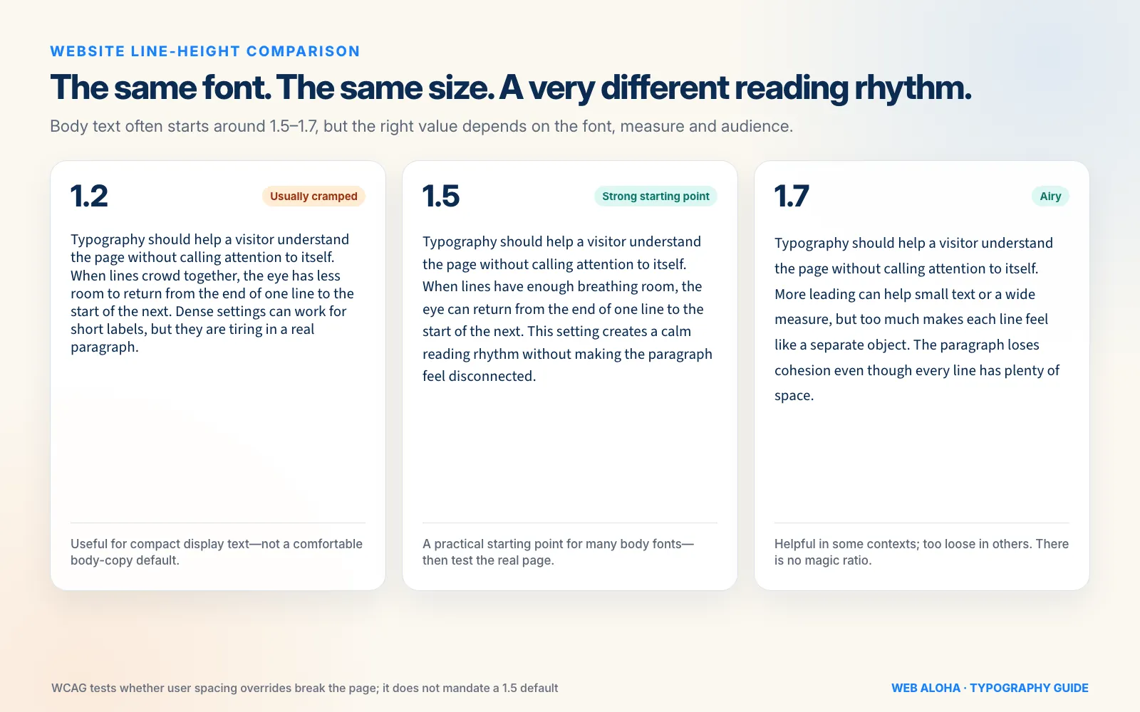
WCAG tests whether user spacing overrides break the page. It does not require every website to use 1.5 line height by default.
Best Line Length for Readable Website Text
A good body font can still become exhausting when a paragraph runs from one side of a wide monitor to the other.
For long-form Latin-script text, aim for roughly 45–75 characters per line, with around 60–70 characters being a useful first test. The web.dev typography guidance cites 45–75 characters as a satisfactory range, while the GOV.UK layout guidance generally keeps lines at no more than 75 characters.
This range is a heuristic, not a universal law:
- Shorter lines can suit forms, cards, sidebars, and mobile layouts.
- Longer lines can work for tables, code, or specialist interfaces where horizontal relationships matter.
- Different scripts and languages need their own measure.
- A narrow font fits more characters into the same physical width than a wide one.
CSS ch units are handy because they create a measure related to character width:
.article-copy {
  max-inline-size: 66ch;
}

/* 16px or larger stops iOS Safari zooming in on focus. */
input,
select,
textarea {
  font-size: max(1rem, 16px);
}
Do not confuse the 45–75 guideline with a WCAG AA rule. WCAG’s enhanced Visual Presentation criterion includes a mechanism for limiting blocks to 80 characters or glyphs per line, but that criterion is Level AAA.
Also, keep long left-to-right body copy left-aligned. Centered paragraphs look dramatic for about two lines and then become a scavenger hunt for where the next line begins. Fully justified web text can create uneven rivers of space unless hyphenation and language support are handled exceptionally well.
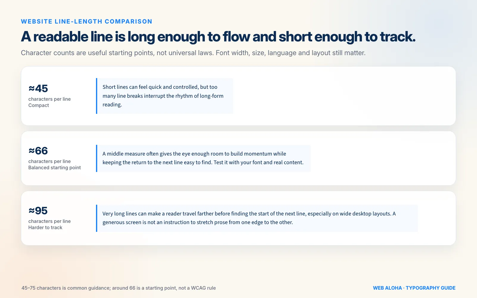
Around 66 characters is a useful first test for long-form copy, not a universal ideal or a WCAG AA rule.
Build a Clear Website Typography Hierarchy
Hierarchy tells a visitor what to read first, what belongs together, and what can be skimmed. Size is one tool, but it is not the whole toolbox.
You can create hierarchy through:
- Size
- Weight
- Space above and below
- Font family or style
- Color and contrast
- Position and width
- Labels, eyebrows, and supporting text
Use these signals with restraint. If the H1 is huge, bold, uppercase, italic, gradient-filled, outlined, animated, and wearing a little digital hat, the typography is no longer helping the message.
Visual Heading Style Is Not Semantic Heading Structure
Use actual h1 through h6 elements to describe the content structure. Styling a paragraph to look large does not make it a heading for assistive technology or document navigation.
MDN’s heading guidance recommends one page-describing H1, then nested heading levels without skipping from H2 to H4 simply because H4 happens to look nicer. Style the element you need; do not rewrite the document outline to get a smaller font.
A practical article hierarchy might be:
- H1: the page topic
- H2: major questions or stages
- H3: important parts within an H2 section
- Body: the explanation
- Small/supporting: sources, dates, captions, and secondary notes
Good hierarchy works in grayscale and without decorative effects. Blur your eyes slightly or step back from the screen: the reading order should still be obvious.
How to Create a Website Type Scale
A type scale is a limited set of reusable sizes. It gives every text role a home and stops a design from collecting one-off values like 37px, 41px, and 43px because three headings “felt a bit different.”
You can build a scale mathematically with a ratio such as 1.2 or 1.25, but the ratio is a starting framework, not a promise that every generated step will work.
For example, a simple scale could use:
| Token | Size | Suggested role |
|---|---|---|
--text-sm | 0.875rem | Supporting text |
--text-base | 1rem | Body |
--text-lead | 1.25rem | Introduction |
--text-h3 | 1.563rem | Subheading |
--text-h2 | 2rem | Section heading |
--text-h1 | 2.5rem | Page title |
Then test the system with real headlines, not “Heading goes here.” A five-word H1 and a 14-word H1 behave very differently. Check the longest service name, the messiest blog title, prices, percentages, accented characters, and translated content.
One typeface with enough weights and a good italic can build a complete hierarchy. You do not need to force a second family into the design. When you do want contrast between families, the companion website font selection guide covers pairing, brand fit, licensing, and language support in detail.
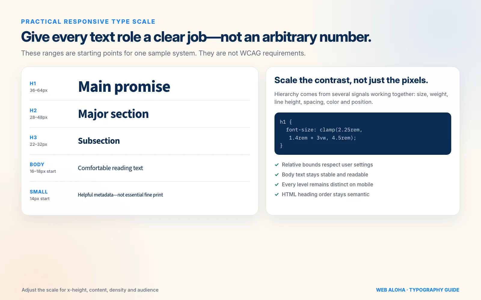
Treat the ranges as a sample system. Adjust them for the typeface’s x-height, the content, the interface density, and the audience.
Responsive Typography for Mobile and Desktop
Responsive typography does not mean shrinking every desktop size by the same percentage. Body text, navigation, headings, and display text have different jobs.
Keep Body Text Stable
Body copy usually needs little or no reduction on mobile. The viewport is smaller, but the device is also held closer and used in less predictable conditions. Keep body text readable and let the column become narrower.
Scale Display Headings More Aggressively
A 72px H1 may feel confident on a wide screen and ridiculous on a 360px phone. Large headings are the best candidates for fluid scaling because they have more distance to travel between mobile and desktop.
CSS clamp() sets a minimum, a fluid preferred value, and a maximum:
h1 {
  font-size: clamp(2rem, 1.25rem + 3vw, 4rem);
  line-height: 1.08;
  text-wrap: balance;
}
Use our CSS Clamp Generator to calculate a starting value, then test the full heading scale together. If every level grows at a different rate, H2 can accidentally catch H1 at one viewport width.
Avoid using viewport units alone for essential text. A rule such as font-size: 5vw can resist user text enlargement, and W3C documents incorrect viewport-unit sizing as a potential resize-text failure. Relative minimum and maximum values plus a modest viewport component create a safer fluid range.
The example above lets the H1 move from 2rem to 4rem. Its maximum is at least twice the minimum, which leaves room for text enlargement. Still test it: good-looking CSS is not the same thing as accessible CSS.
Responsive Type Is More Than Font Size
At narrow widths:
- Let cards and columns stack.
- Allow headings, buttons, and navigation labels to wrap.
- Remove fixed heights from text containers.
- Avoid placing important copy over busy images.
- Watch long words, email addresses, and URLs.
- Keep tap targets large even when their labels are short.
After implementation, use the Mobile-Friendly Checker as a first pass, then test real devices, landscape orientation, browser zoom, and enlarged system text.
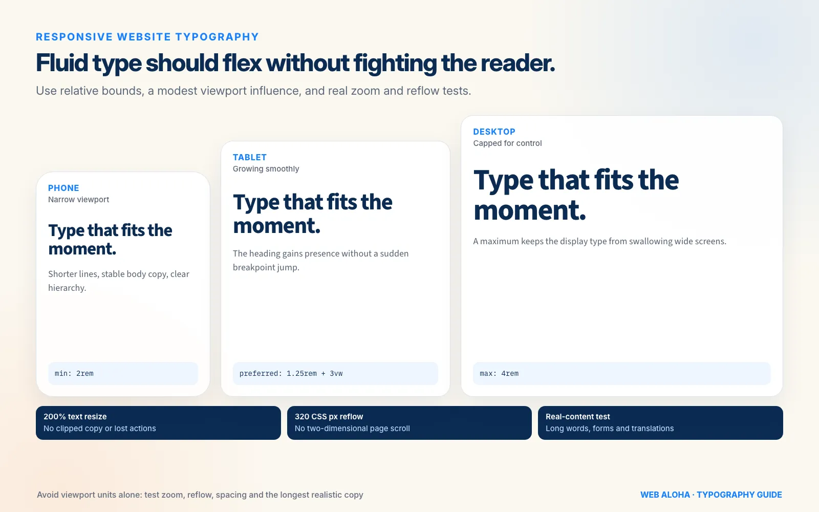
Fluid does not mean uncontrolled. Give display type sensible relative bounds, then test zoom, reflow, spacing overrides, and the longest realistic copy.
Form Fields Need 16px Text on iPhone
Safari on iPhone zooms the page in when someone taps a form field whose text is smaller than 16px, and the visitor then has to pinch back out. WebKit’s own source sets the zoom on focus to 16 divided by the field’s font size (WKWebViewIOS.mm, checked 17 October 2026), so fields at 16px or larger do not trigger it.
Set input, select and textarea to at least 1rem (16px), as in the CSS starter below. Do not stop the zoom with maximum-scale=1 or user-scalable=no in the viewport tag instead: other browsers, such as Chrome on Android, honour those settings and block pinch zoom, which people with low vision rely on.
Accessible Website Typography and WCAG 2.2
Accessible typography is not one font size. It is a set of outcomes that lets more people read, resize, restyle, and navigate the content.
Here are the key WCAG 2.2 Level AA checks:
| WCAG topic | Requirement | What to test |
|---|---|---|
| Contrast, 1.4.3 | 4.5:1 for normal text; 3:1 for qualifying large text | Text, links, placeholders, hover and focus states |
| Resize Text, 1.4.4 | Text can enlarge to 200% without loss of content or functionality | Zoom, text-only resize, controls, labels, dialogs |
| Reflow, 1.4.10 | Most content works at a width equivalent to 320 CSS px without two-dimensional scrolling | 400% zoom from a 1280px viewport or an equivalent narrow view |
| Text Spacing, 1.4.12 | User spacing overrides do not clip, overlap, or hide content | Increased line, paragraph, letter, and word spacing |
Check every color combination with our Color Contrast Checker. Do not assume large or bold text automatically passes: the foreground and background colors still need to meet the correct threshold. W3C also notes that very thin or unusual letterforms can appear fainter after anti-aliasing even when their CSS colors pass mathematically.
An Accessibility Checklist Beyond the Ratios
- Use real text instead of baking important words into images.
- Make links identifiable without relying only on color.
- Keep focus indicators visible.
- Do not lock text inside fixed-height cards or buttons.
- Let users zoom without overlapping sticky headers and pop-ups.
- Check
I, lowercasel, and1, plusOand0, in UI-critical text. - Test accents, currency symbols, punctuation, numerals, and every language the site publishes.
- Respect
prefers-reduced-motionif type animates. - Never make users rotate their phone just to read a paragraph.
Accessibility testing should use real content and real states. A clean style-guide specimen rarely contains a three-line button label, a validation error, or a customer with 200% zoom enabled. The live website will.
Website Font Performance and Layout Stability
Typography affects performance because web fonts are files that must be discovered, downloaded, decoded, and rendered. A late font can delay visible text or swap into a fallback with different dimensions, causing layout shift.
The current web.dev font best-practices guide recommends focusing on three parts: loading, delivery, and rendering.
Load Less
- Use only the families, styles, scripts, and weights the page needs.
- Prefer WOFF2 for modern web-font delivery.
- Use system fonts when the brand does not need a downloaded face.
- Subset carefully, without deleting glyphs required by your languages.
- Avoid icon fonts when accessible SVG icons can do the job.
Variable fonts can replace several static files when the design genuinely uses a range of weights, widths, or optical sizes. They are not automatically smaller than one static font file, so compare the actual transferred bytes.
Choose font-display Deliberately
font-display: swap shows fallback text quickly and swaps in the web font when it arrives, but a metric mismatch can create a visible jump. font-display: optional favors stability and may keep the fallback on slower connections. block prioritizes showing the chosen face eventually but can delay visible text.
There is no universal winner. Body text, a distinctive display heading, and a decorative campaign wordmark can justify different strategies.
Self-Hosting Is an Option, Not a Magic Spell
Self-hosting removes a third-party connection and can improve privacy and control. It is not automatically faster. Your CDN, caching, compression, font subsets, and discovery order still matter.
It is also the norm at the top of the web: in our study of the fonts on the top 1,000 websites, most homepages served their font files from their own domain or CDN rather than from Google Fonts.
If you are considering it, our Font Self-Hosting Helper creates the basic @font-face setup. Check the font’s specific license before downloading, modifying, subsetting, or redistributing it.
Preload only a font that is genuinely critical above the fold. Preloading every weight makes the browser fight itself for bandwidth. For late-swap layout shift, matching fallback metrics with size-adjust and related font metric overrides can help, but measure the real result rather than adding advanced CSS for sport.
Website Typography Trends for 2026
The useful 2026 trend is not “make all text enormous.” It is more control with fewer arbitrary compromises.
Fluid Type Scales Are Becoming the Normal Choice
Designers can move large headings smoothly between sensible bounds with clamp() instead of creating a staircase of breakpoint jumps. The accessibility work remains the same: relative units, generous bounds, 200% zoom, and narrow reflow testing.
Variable Fonts and Optical Sizing Are Maturing
A capable variable family can provide fine-grained weight, width, and optical-size control. With a font that supports the opsz axis, font-optical-sizing: auto can adapt letterforms for small text or display sizes. Use the feature because the design benefits, not because the variable-font badge looks futuristic.
Browsers Can Improve Headline Wrapping
text-wrap: balance is a neat progressive enhancement for short headings, captions, and quotations. MDN recommends it for short blocks, where balancing line lengths can avoid one lonely word on the final line. Do not apply expensive wrapping behavior blindly to every paragraph.
Expressive Type Is Back, but Readability Did Not Leave
Recent 2026 typography trend reporting points to characterful serifs, revived display faces, oversized editorial headlines, and more human texture pushing back against years of interchangeable geometric sans-serif branding. Great. The web could use some personality.
Keep the experimentation mostly in display roles. Body copy, forms, navigation, prices, and legal information still need clarity. Kinetic typography also needs restrained motion, selectable real text, and a reduced-motion alternative.
Trends are seasoning. Your typography foundation should still make sense after the 2026 mood board has floated out to sea.
A Practical Website Typography CSS Starter
This example gives a business website a restrained, responsive foundation:
:root {
  --text-sm: 0.875rem;
  --text-base: 1rem;
  --text-lead: clamp(1.125rem, 1.05rem + 0.4vw, 2.25rem);
  --text-h3: clamp(1.25rem, 1.05rem + 0.5vw, 2.5rem);
  --text-h2: clamp(1.75rem, 1.15rem + 1.5vw, 3.5rem);
  --text-h1: clamp(2rem, 1.25rem + 3vw, 4rem);
}

body {
  font-family: "Your Body Font", system-ui, sans-serif;
  font-size: var(--text-base);
  line-height: 1.6;
}

h1,
h2,
h3 {
  line-height: 1.12;
  text-wrap: balance;
}

h1 {
  font-size: var(--text-h1);
}

h2 {
  font-size: var(--text-h2);
}

h3 {
  font-size: var(--text-h3);
}

.article-copy {
  max-inline-size: 66ch;
}
Do not paste it into production and declare victory. Replace the font stack, test the real content, check the hierarchy at several widths, and make sure every fluid range behaves at zoom.
The fluid ranges above use relative minimum and maximum values, with each maximum at least twice its minimum. That leaves room for enlargement, but it does not prove conformance by itself. If a clamped value or component prevents users from reaching 200% text enlargement, revise it. Accessibility is judged by the result, not by whether the code contains fashionable functions.
How to Audit Website Typography
You can run a useful typography audit without rebuilding the whole site:
- Inventory the font system. Use the Website Font Checker to find declared families, sources, stacks, files, and weights. Confirm final computed styles in DevTools.
- List text roles. Record body, lead, H1–H4, navigation, buttons, forms, captions, prices, and error messages.
- Measure the basics. Check font size, line height, paragraph spacing, line length, weight, and alignment for each role.
- Check hierarchy. Read only the headings. Do they explain the page, follow a logical semantic order, and look meaningfully different?
- Test contrast and states. Include links, visited links, placeholders, disabled text, hover, focus, errors, and text over images.
- Stress the layout. Test 200% text enlargement, 400% reflow, increased text spacing, long words, translated copy, and the largest realistic numbers.
- Throttle font loading. Watch for invisible text, distracting swaps, and layout shift.
- Remove waste. Delete unused families and weights, then compare the visual result and transferred font bytes.
- Test on real screens. Desktop responsive mode is helpful, but it is not a phone held outdoors with the browser text enlarged.
If your audit uncovers a few inconsistent sizes, fix the tokens and components. If the typography is tangled into an outdated layout, a proper website redesign may be more sensible than nudging font sizes one card at a time.
Website Typography Checklist
Before publishing, check that:
- Body text is comfortable with the actual typeface and audience.
- Long-form copy stays around 45–75 characters per line where appropriate.
- Body line height is comfortable, usually starting around 1.5–1.7.
- H1, H2, H3, body, and supporting text are clearly distinguishable.
- Heading HTML follows the content structure.
- Essential text is not tiny, faint, or trapped in an image.
- Normal and large text meet their WCAG contrast thresholds.
- Text enlarges to 200% without lost content or functionality.
- The page reflows at a width equivalent to 320 CSS pixels.
- User spacing overrides do not clip or overlap content.
- Mobile headings wrap cleanly and body text stays readable.
- Form fields use at least 16px text, so iPhones do not zoom in when they are tapped.
- Every font has the required accents, symbols, numerals, and languages.
- Fallback fonts are sensible and generic families end the stack.
- Only necessary font files and weights load.
- Font swapping does not create disruptive layout shift.
- The complete system has been tested with real content, not just a perfect design sample.
Typography is one of those website details that looks simple right until you try to make it work everywhere. When it is done well, the brand feels sharper, the content becomes easier to scan, and the interface stops making visitors work for basic understanding.
Need a typography system built as part of the whole website? Our web design services cover strategy, content, design, development, and launch. That is a lot more than choosing a trendy font and hoping for the best.
Frequently asked questions
What is the best font size for website body text?
For most business websites, 16–18px (1–1.125rem at the usual browser default) is a practical starting range for body text. It is not a WCAG rule, and the right size depends on the font's x-height, weight, line length, audience, and screen. Test the actual typeface instead of approving a number in isolation.
What is the best line height for website text?
Start around 1.5–1.7 for ordinary body copy and adjust for the typeface and line length. Short headings usually need tighter line height, often around 1.05–1.25. Use a unitless value so the spacing scales with the font size. WCAG does not require every site to use 1.5 by default.
How long should a line of website text be?
A useful target for long-form body copy is about 45–75 characters per line, with roughly 60–70 characters often feeling comfortable. This is a typography guideline, not a universal WCAG AA requirement. Use a width in ch units, then test it with your actual font, content, and layout.
Should website text be smaller on mobile?
Body text usually should not shrink much on mobile. Keep it readable, reduce oversized display headings, and let the layout reflow instead. A fluid type scale with sensible minimum and maximum values can smooth the transition, but it still needs testing at 200% zoom and narrow viewport widths.
Should website font sizes use px, rem, em, or clamp?
Use rem for most type tokens, em where a component should scale from its own context, and clamp() for selected fluid headings or display text. Pixels can still be useful as design references, but relative CSS units respect user settings more naturally. Avoid viewport units alone for essential text.
What is a website type scale?
A type scale is a small, repeatable set of text sizes assigned to roles such as body, lead, H3, H2, and H1. It creates hierarchy without inventing a new size for every component. The exact ratio matters less than clear contrast between roles and consistent use across the website.
What does WCAG require for website typography?
At WCAG 2.2 Level AA, normal text needs 4.5:1 contrast and qualifying large text needs 3:1. Text must resize to 200% without losing content or functionality, most content must reflow at a width equivalent to 320 CSS pixels, and user-applied text spacing must not cause clipping or overlap. WCAG does not prescribe a universal minimum body font size.
Do web fonts slow down a website?
They can. Extra font files and third-party connections add work, late fonts can delay text, and swapping to a font with different metrics can shift the layout. Use only the families and weights you need, serve WOFF2, choose font-display deliberately, and test whether self-hosting or a variable font actually improves your setup.
How do I audit the typography on an existing website?
Start by identifying the declared font families, sources, files, stacks, and weights with the WebAloha Website Font Checker. Then verify computed styles in your browser, measure body size, line height, line length, and contrast, and test mobile layouts, 200% zoom, narrow reflow, slow font loading, and user text-spacing overrides.